█Helio Costa is a multi-disciplinary designer with 9+ years of experience, focused on high quality output for digital products and brands.
█Occasionally signing under the ©SOL alias for underground ventures.
Features→2021. Brazilians Who Design
→2021. Criacura
Contact→[email protected]Full resume at Linkedin.
Giro App Redesign
2024-25
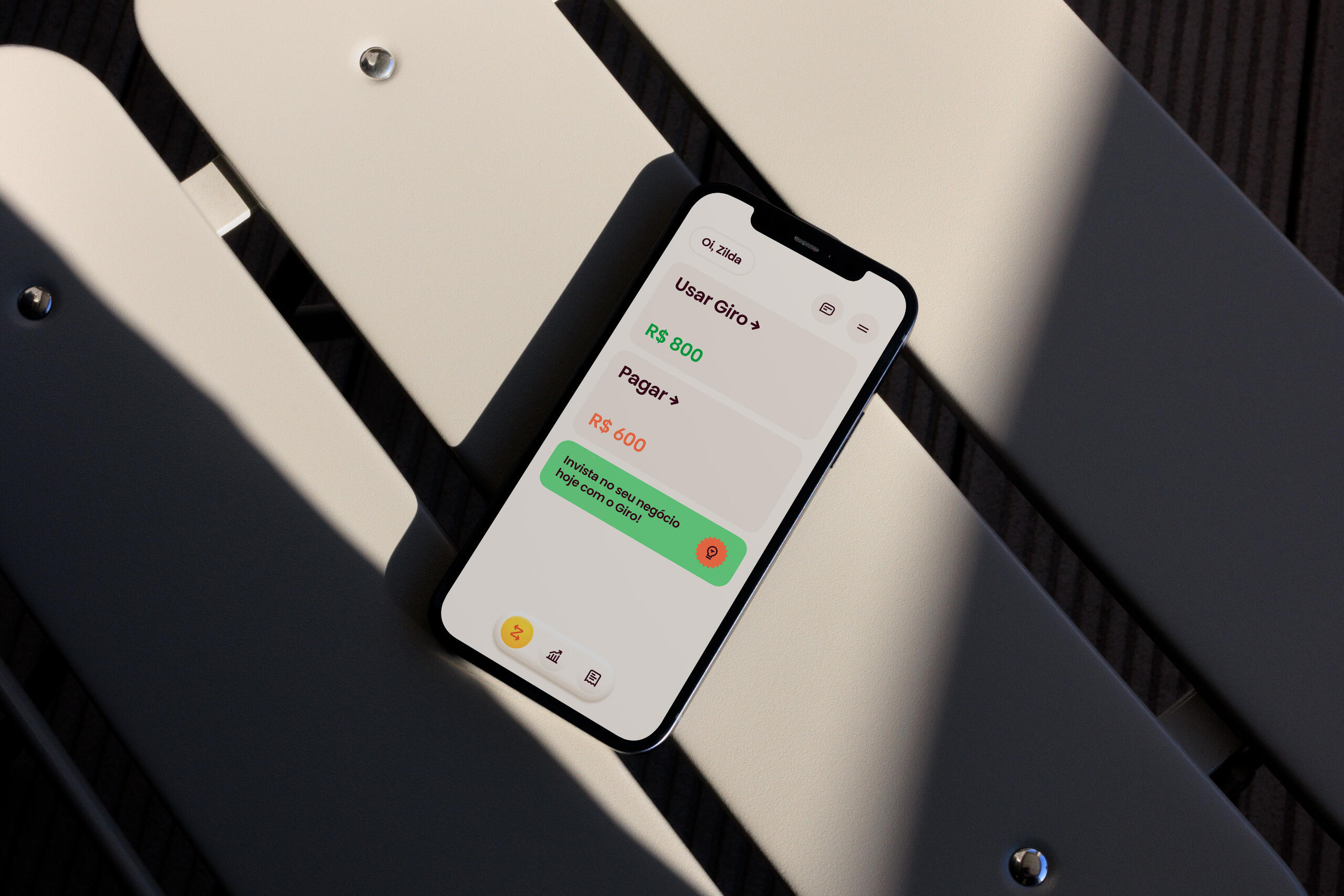
Complete design and architecture overhaul on a flash-loan app for small entrepreneurs
Case under construction ↑
Nubank Application Squad ID
CREDITS
Concept & Art direction
Hélio Costa
3D & Motion
Everton Guilherme
Additional credits
Paulo Assunção
Claudio Gonzalez
Ariane Morganti
CONTEXT / SCOPE
██Nubank has been experiencing an exponential growth for the past 2 years, and as the company grows, all the business unities (B.U.) growths with it - both in scope and team members.
██At a certain point, as my team kept evolving our internal missions and goals through the cycles, we decided to create an identity within our B.U. with the following objectives:
██1. Empower and motivate new and senior members of the Application Squad (SQ) moving forward into 2021;
██2. Translate the team scope in a very visual and intuitive way in order to facilitate our communication with stakeholders across the entire company;
PROCESS
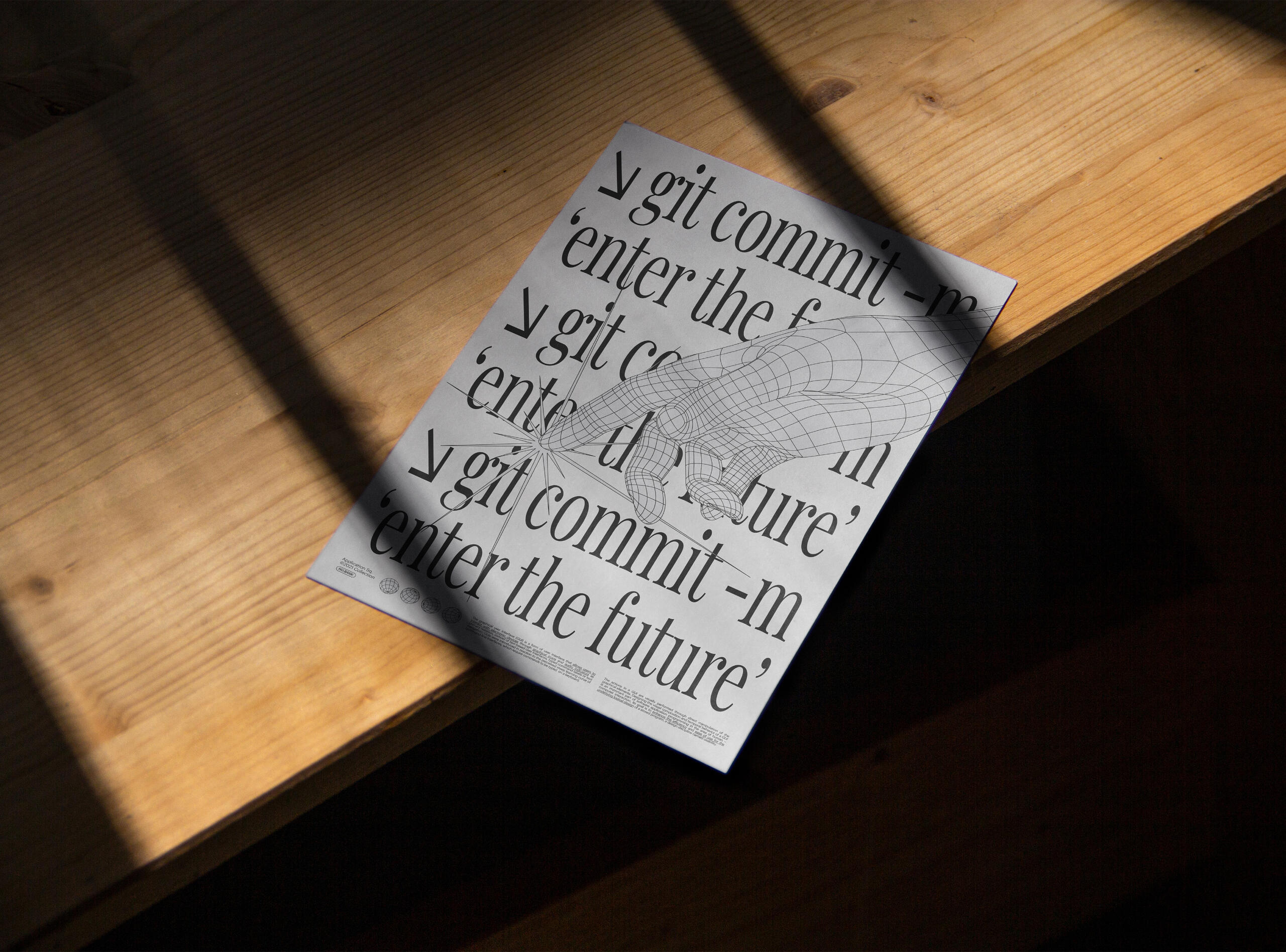
██1. Understand the team preferences in terms of visual styles and directions and gather multiple references that could translate that preference.██2. Put together a first symbol and a sentence that is aligned with the team mission and could also become the central piece of the concept.██3. Expand the concept testing more symbols and possible applications.██4. Create artifacts that could be used on a day-to-day basis: Templates, Icons, Covers, Clothing, Posters, etc.
██To kick off the project, I gather the opinions from my teammates about the possible directions the identity could take using some general references. The preference was something between *retro futurism *(80%) and vintage ads (20%), all from the 90s.
██After that, I put together the company vision and our team mission to see if there could be any additional insight to make the project more rooted in our practices:
██As a company, Nubank's mission has always been in the lines of market disruption and innovation and for years we have been using "The Future is Purple" to manifest that idea.
██As for the Team, which is Application, we own the very first experience and the channels which people come through — Web and App. Our latest mission is to "connect all Brazilians to Nubank products through a seamless application experience".
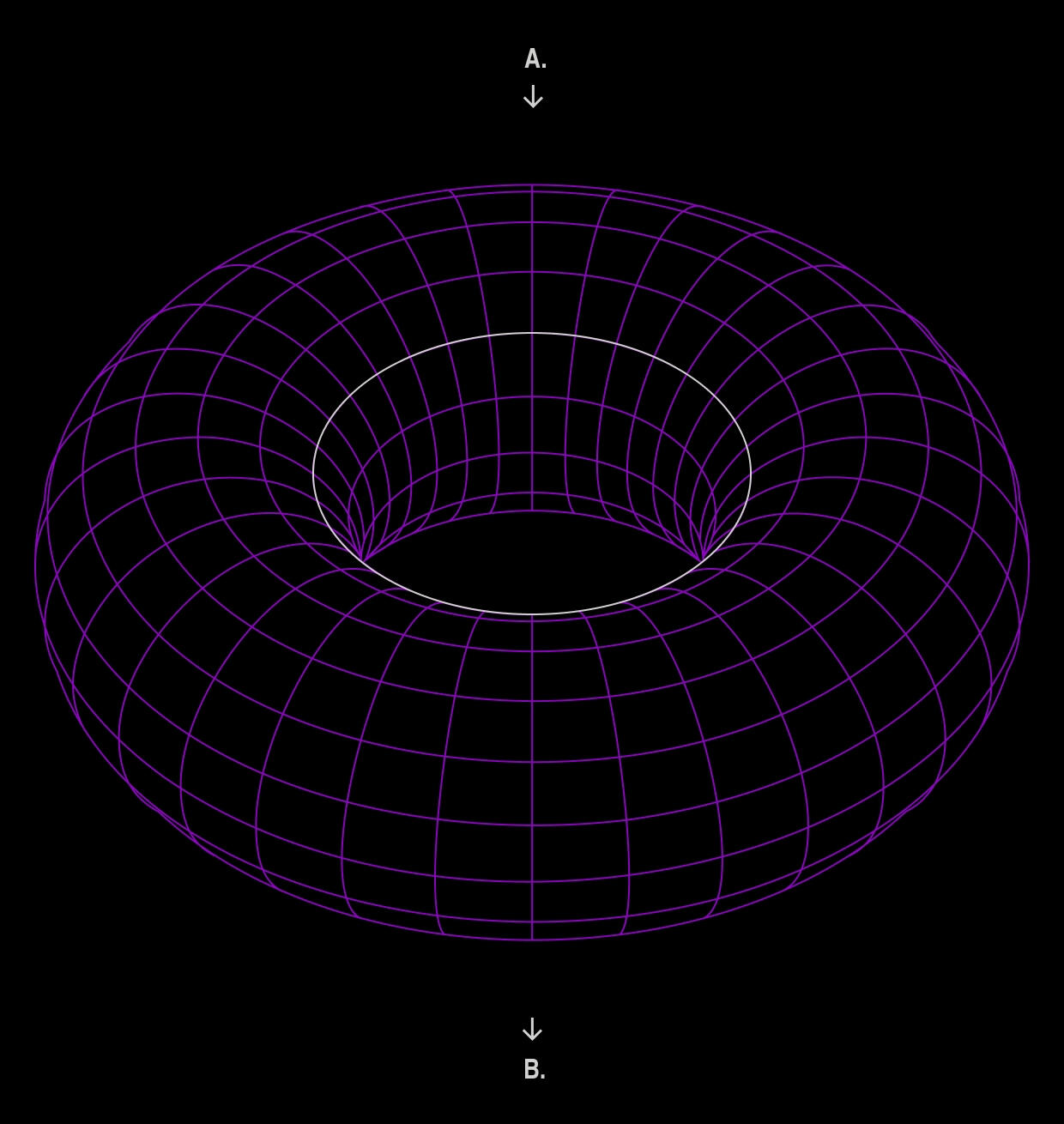
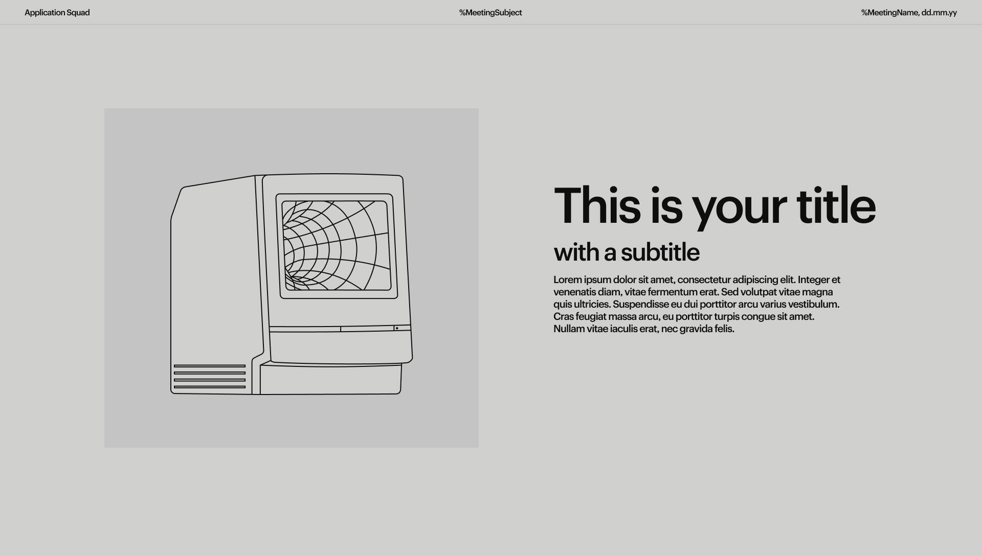
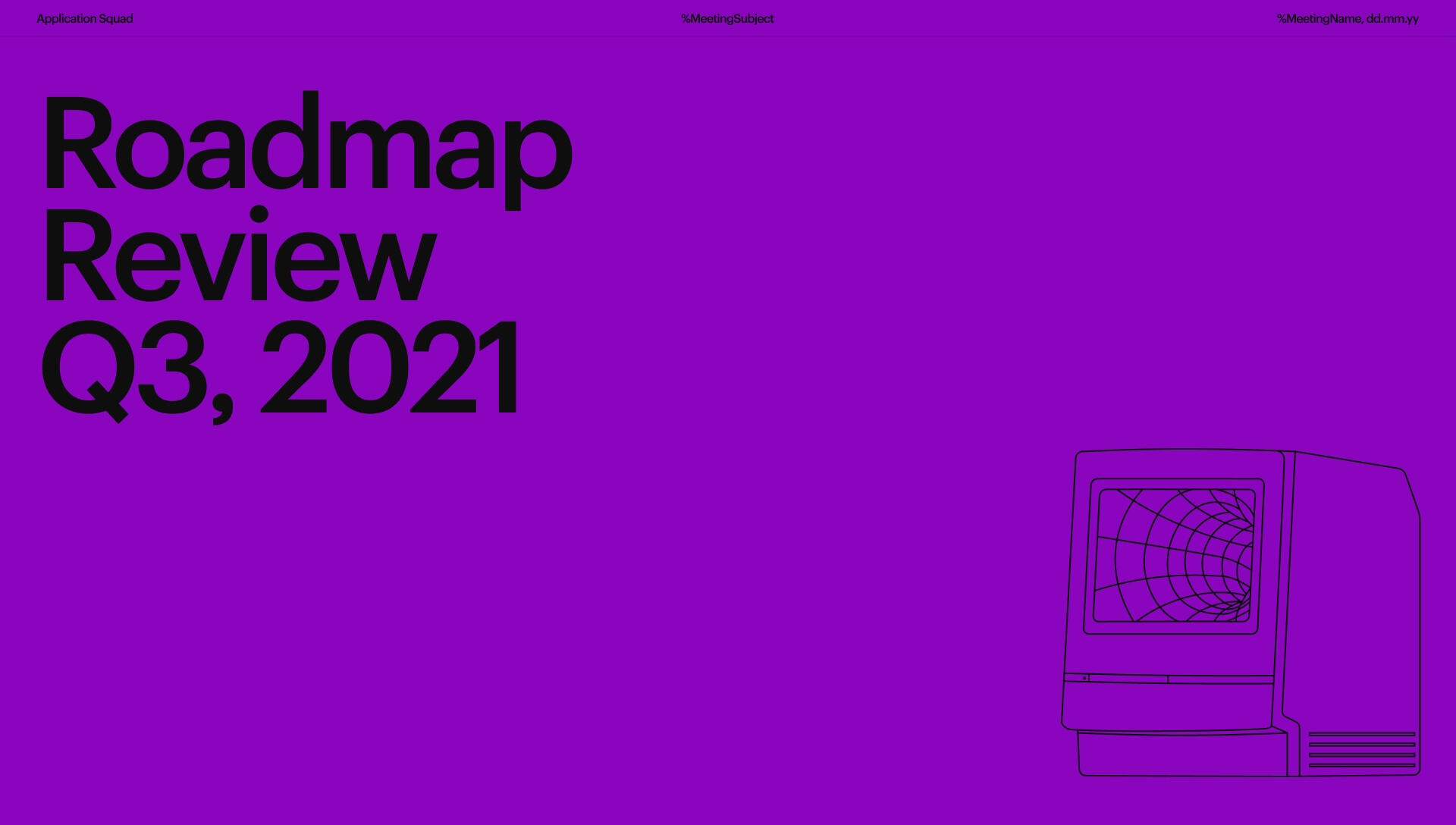
██The most intresting metaphor I could come up with was a "wormhole":██The potential customer sits in point "A", unaware of Nubank existence. Using financial products rooted in the status-quo. Nubank sits in the point "B", representing a promising, non-bureaucratic, future. We, the Application Team, act as a wormhole, connecting these realities.
██With the initial concept pinned down, I started looking for a memorable symbol that could resonate with the idea.
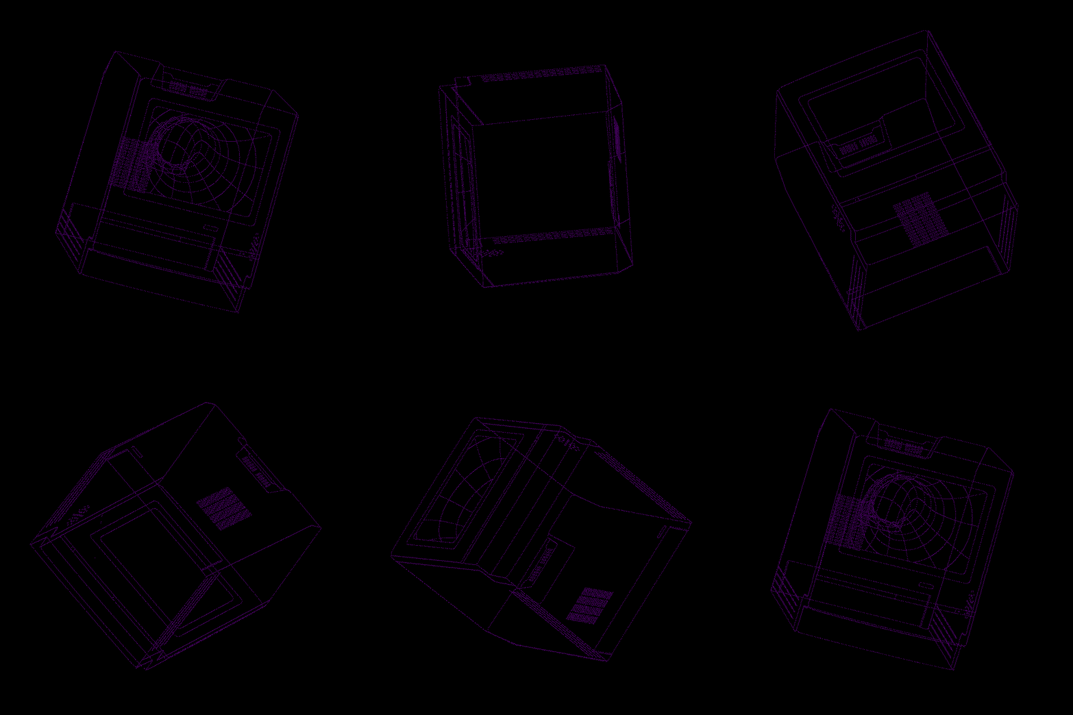
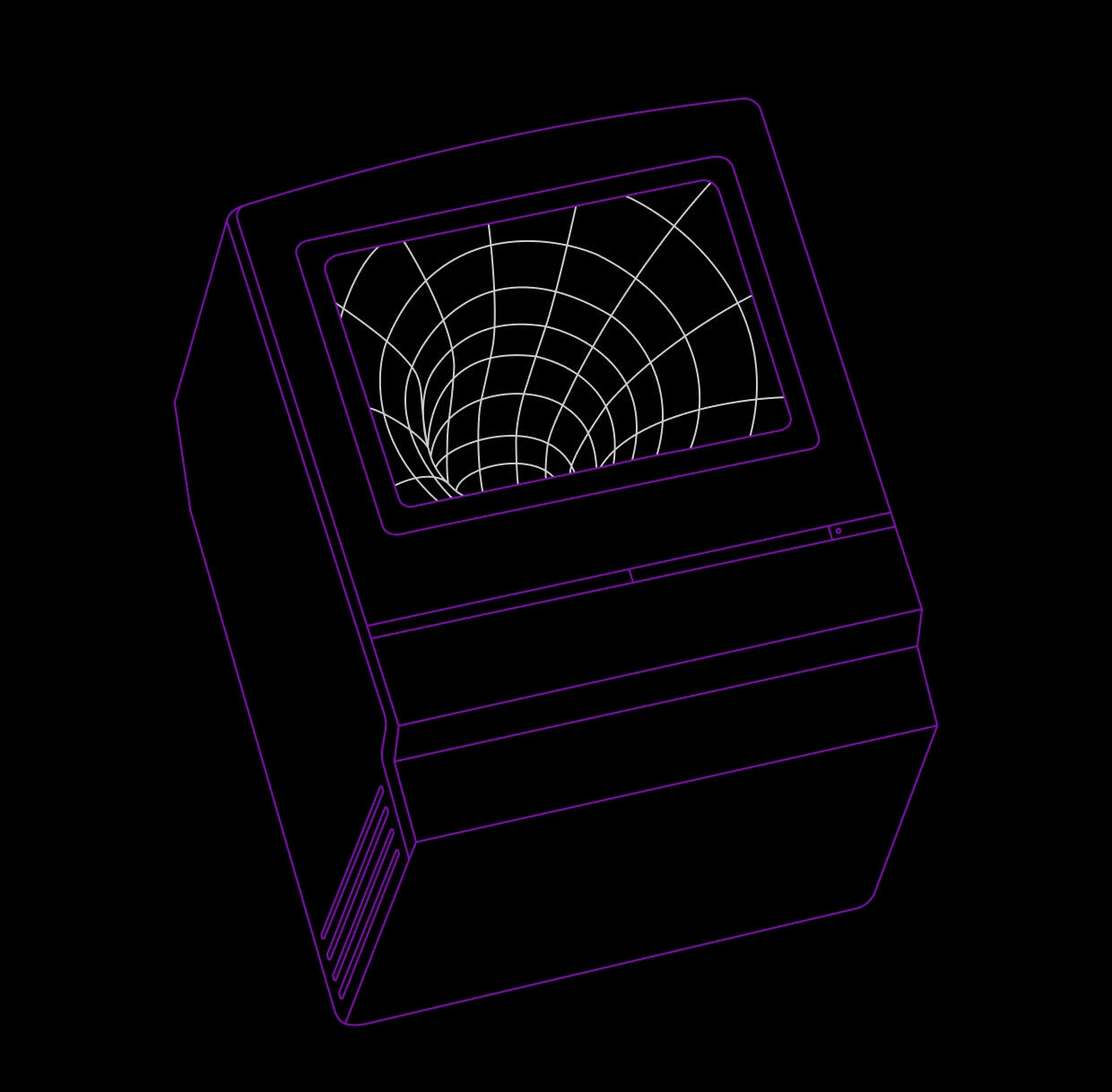
██If my team is the wormhole itself, the devices and channels that our customers come through work as "spaceships".
██Pairing this initial concept with the retro futuristic aesthetics direction for the visuals, I was able to create the main symbol to wrap up the final concept.
01.
Tokens
02.
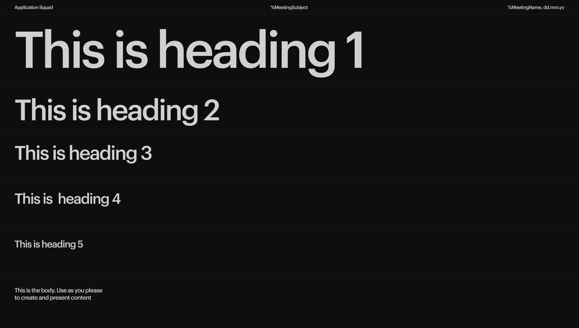
Iconography
03.
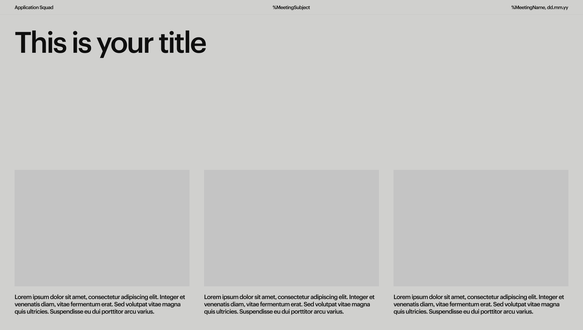
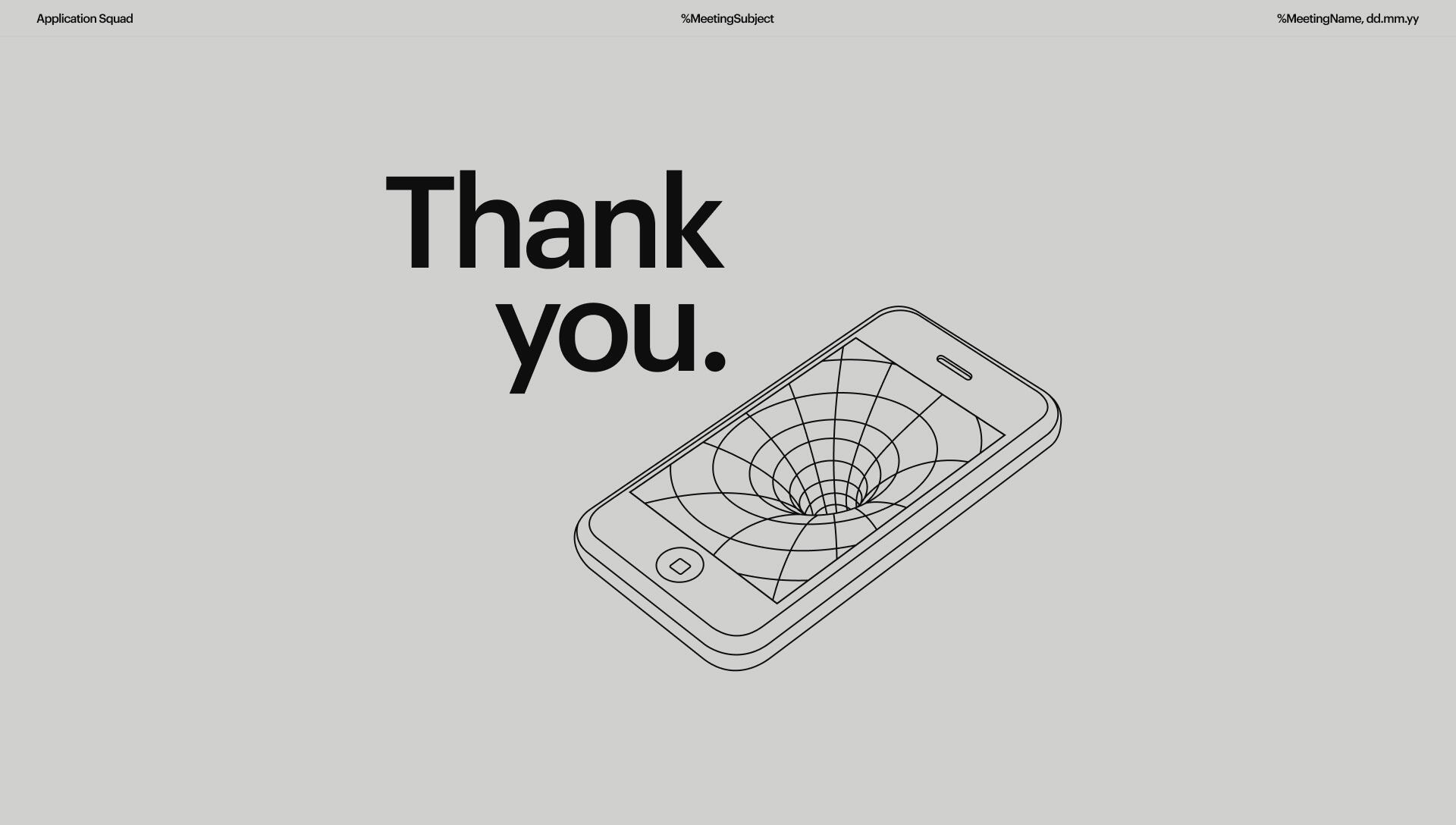
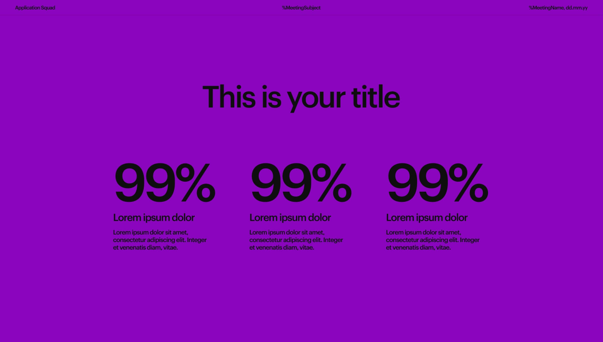
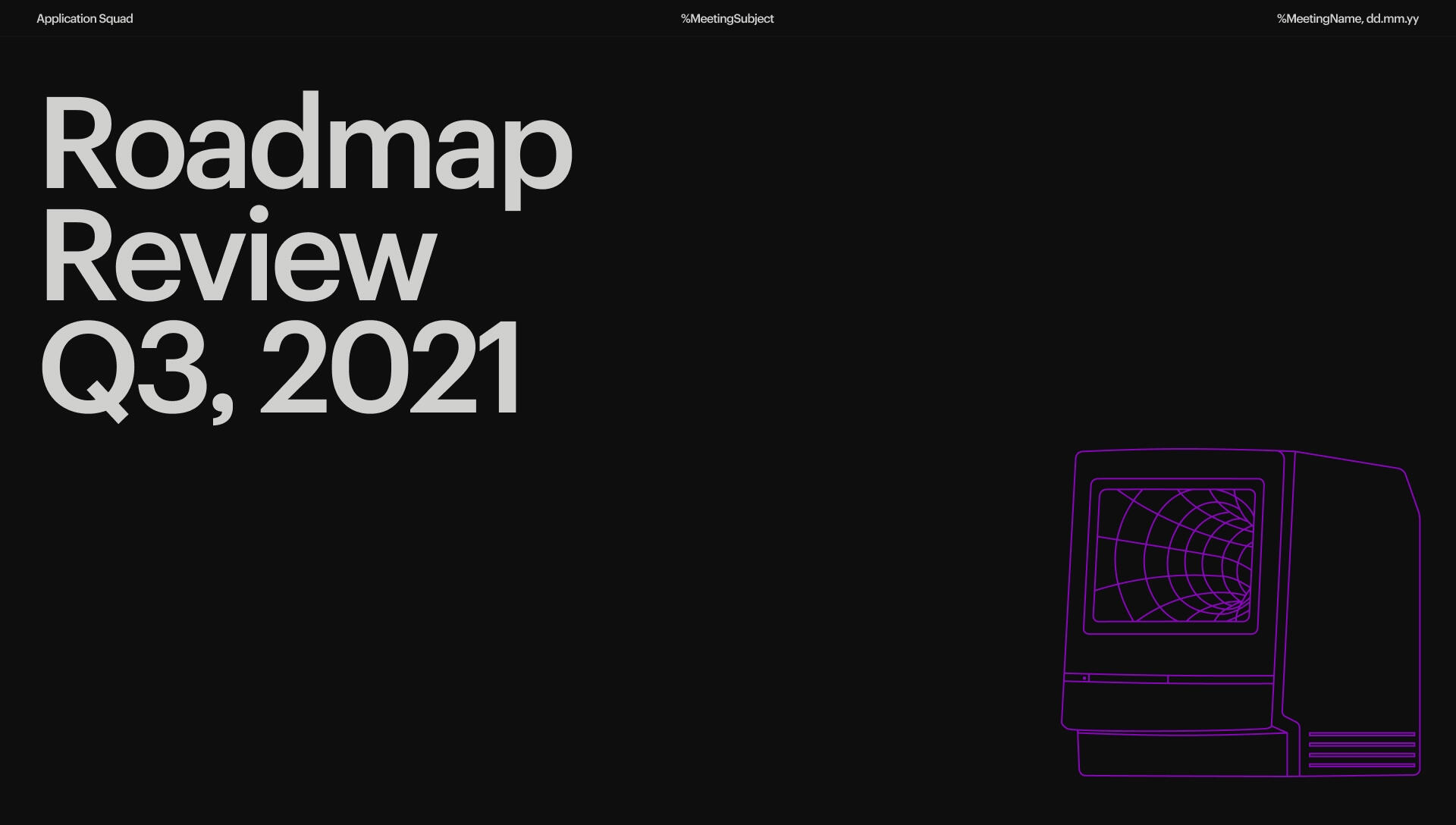
Templates

04.
Swag Collection
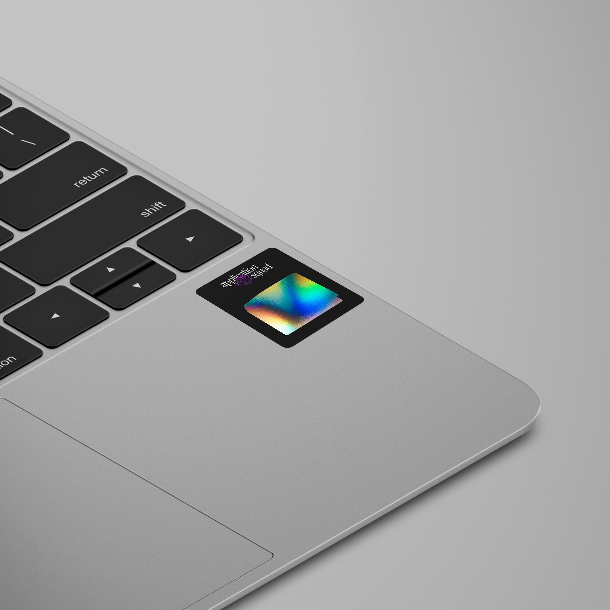
Stickers

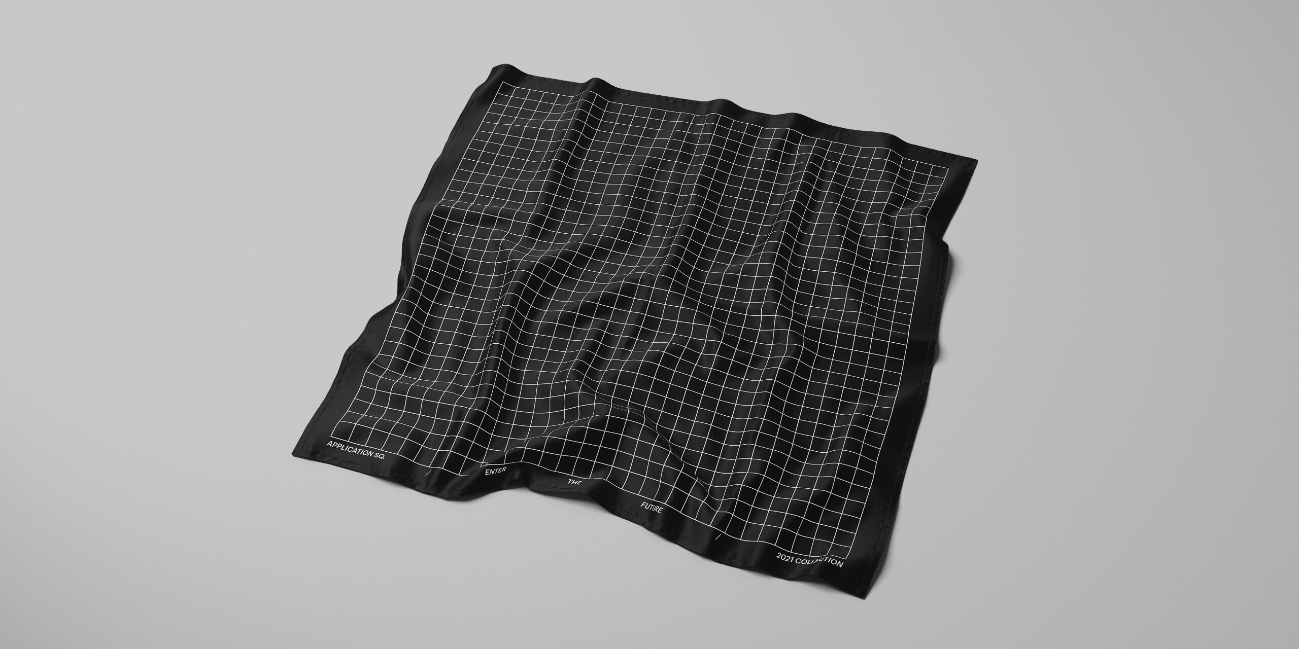
Microfiber cloth
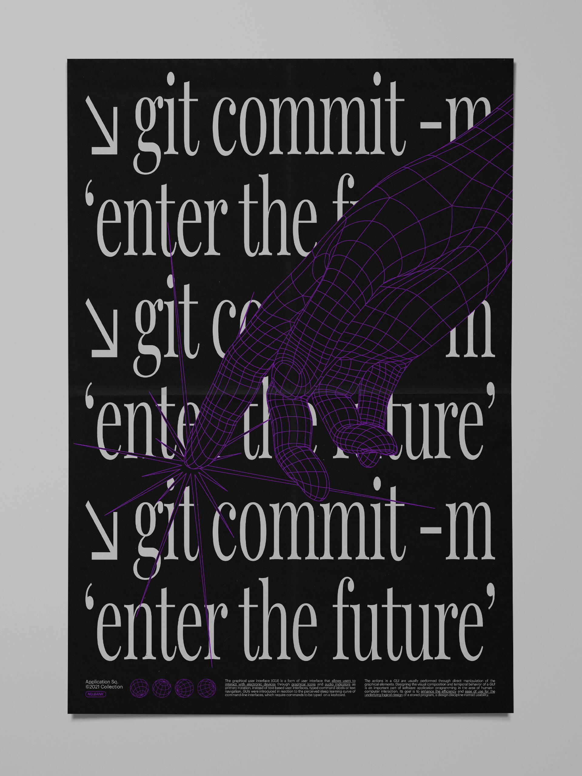
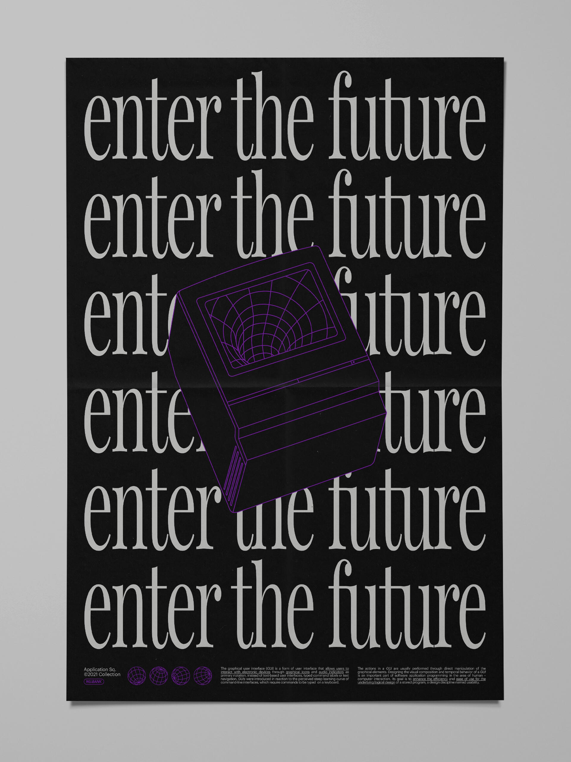
Posters
Nubank Website Language
CREDITS
Concept & Development
Hélio Costa
Additional credits
Luiza Tagliatella
Paulo Assunção
Ariane Morganti
Claudio Gonzalez
Appendix
Nubank Brand System
Nubank Design System 2.0
Massimo Says
CONTEXT / SCOPE
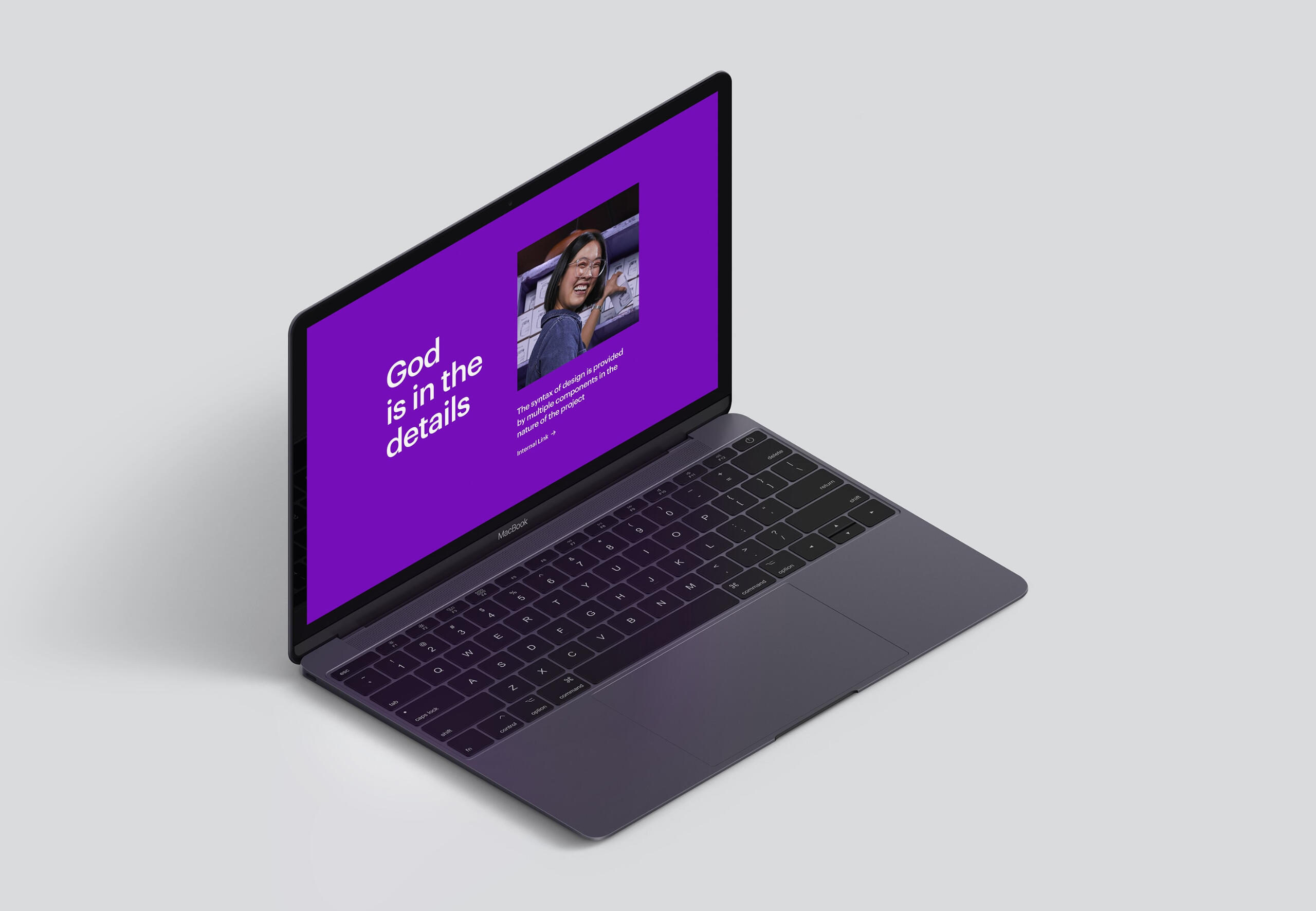
██The main motivation for this project was to format Nubank's website visual language and create design tools to help other peers to build web pages with speed and consistency.
██Unlike the Architecture project, which was about projecting a vision for the future, this one was about piecing together the small parts of the language that were built throughout the last year and a half.
██This language is heavily influenced by two "parents" within Nubank's general design language:
██1. The Brand System: the highest level of guidelines for the entire company where all the typography treatment, color usage and compositions comes from.██2. The Design System (2.0): where all foundation, components, patterns and code semantics used in Nubank's products comes from.
PROCESS
██1. Revisit early drafts of design principles and format them in a way that can help designers make practical decisions when dealing with web pages.██2. Put together most of layouts developed recently and narrow down the amount of variants.██3. Create "smart" templates that works as building blocks and distribute them through a Figma Library within Design System.██4. Lay down guidelines and best practices to design in this context with great autonomy.██5. Establish a process to promote new templates to keep the library alive and consistent
1
Principles
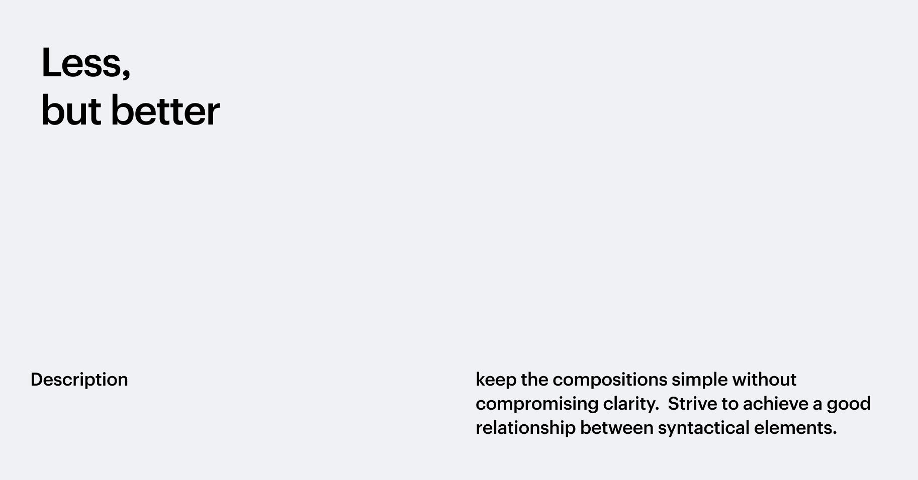
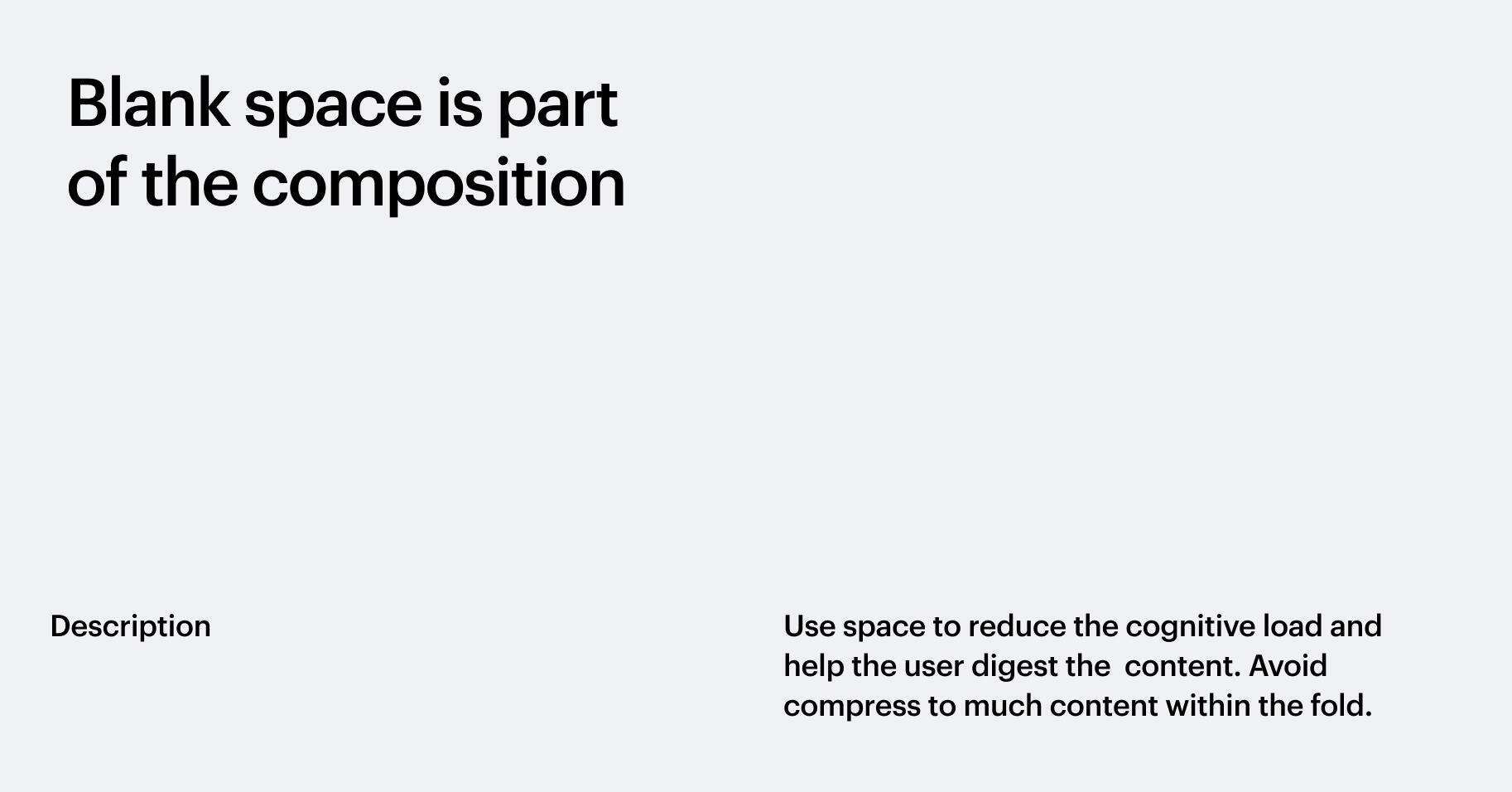
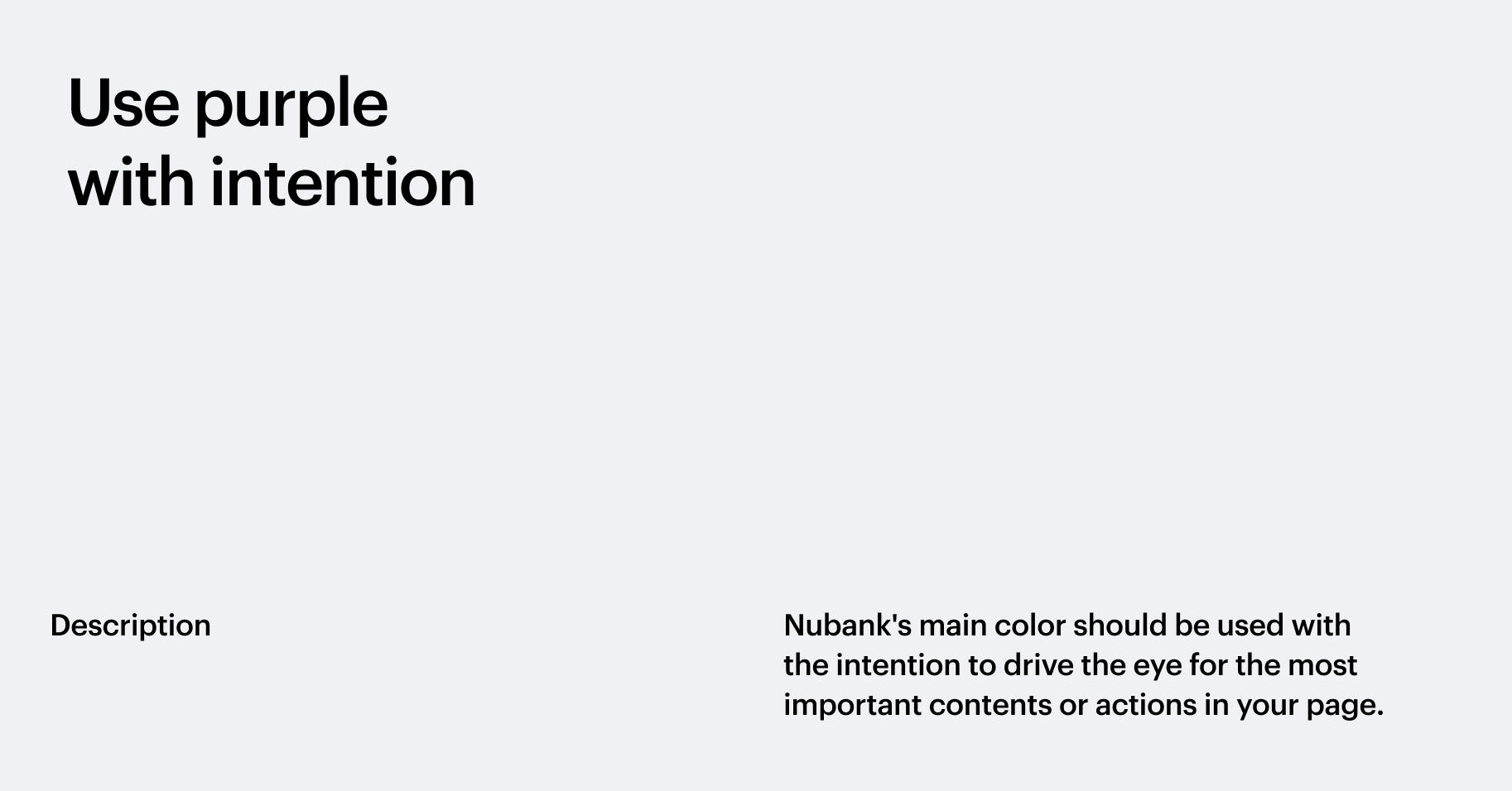
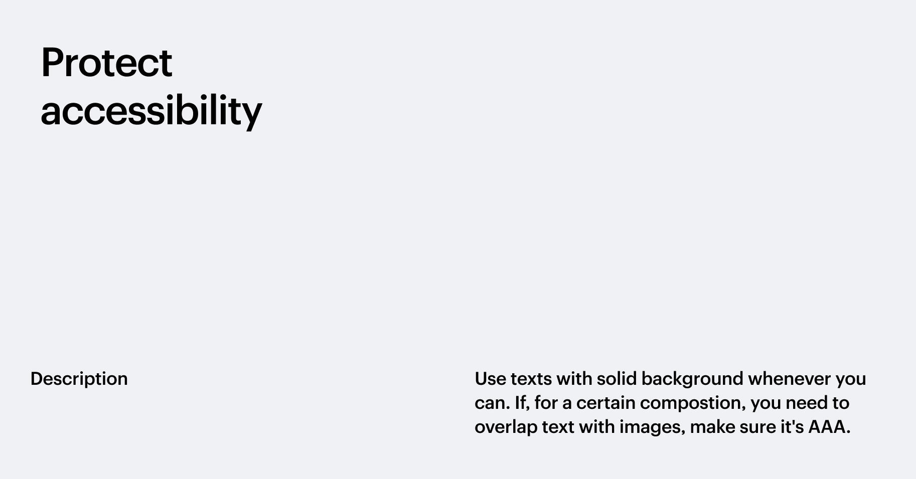
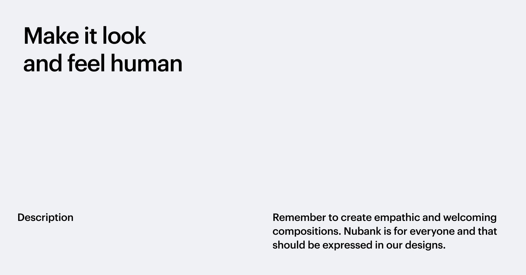
██Simple and actionable principles are a fundamental pillar for any visual language. If done right, it can help designers make decisions and keep the UI consistent, especially in such a hybrid environment such as the web.

2
Layout & Grids
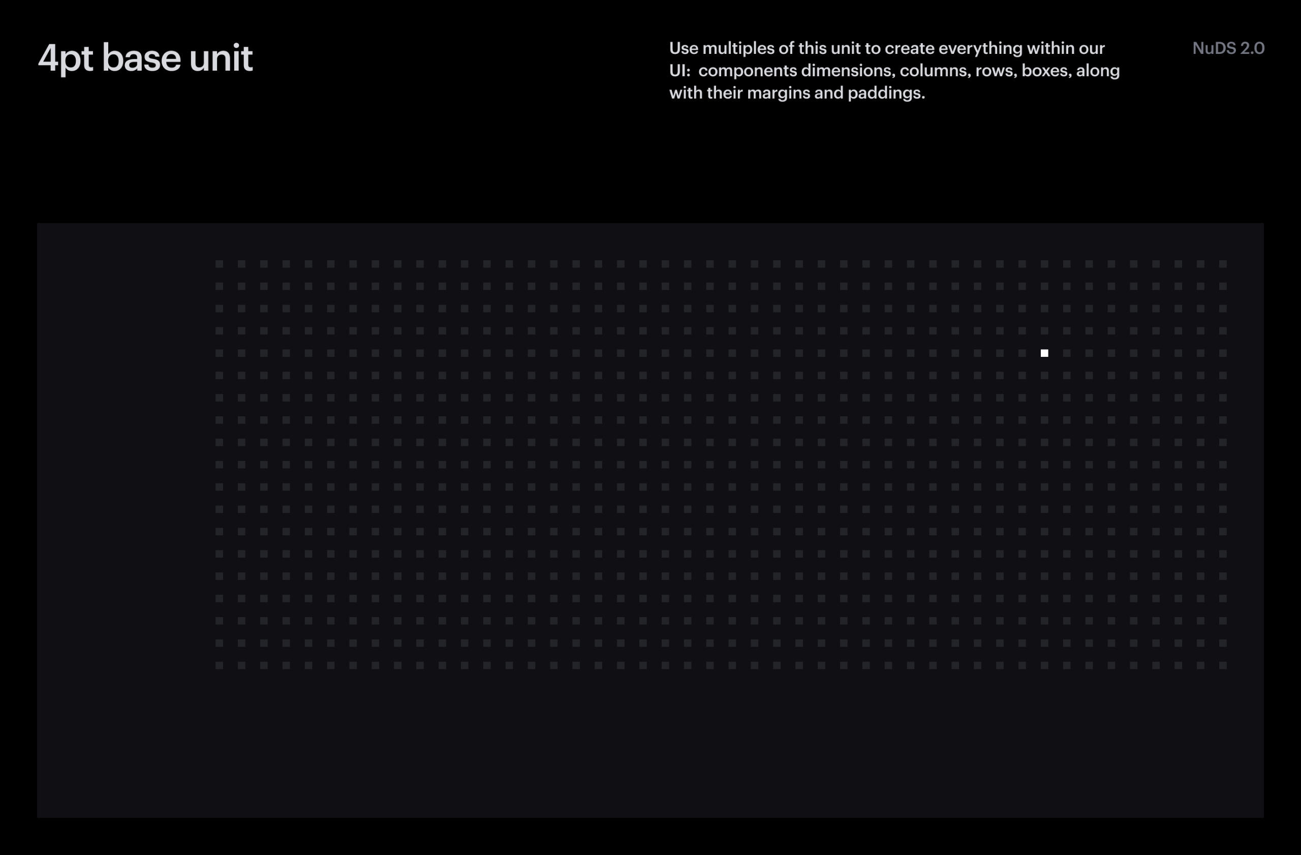
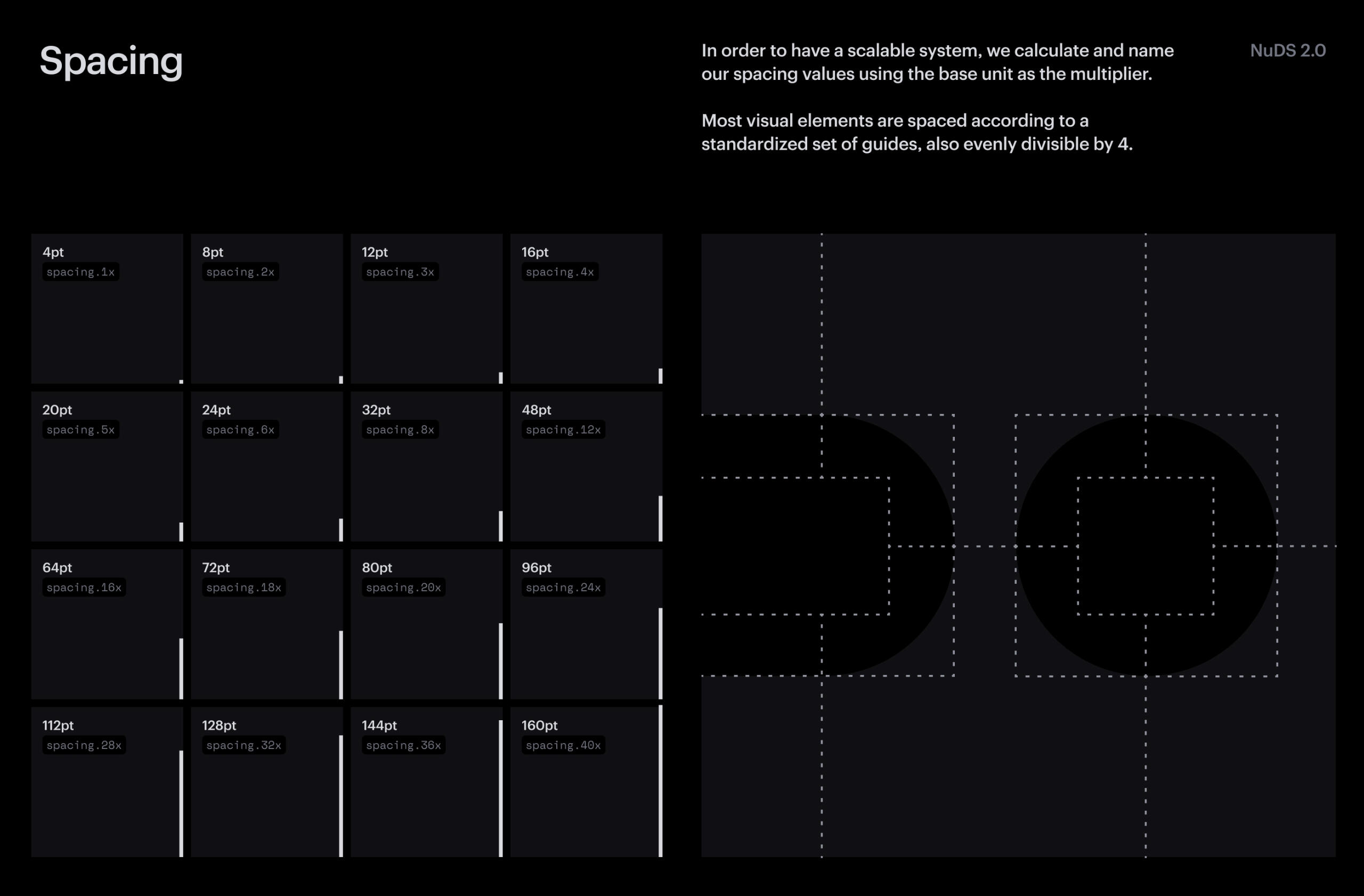
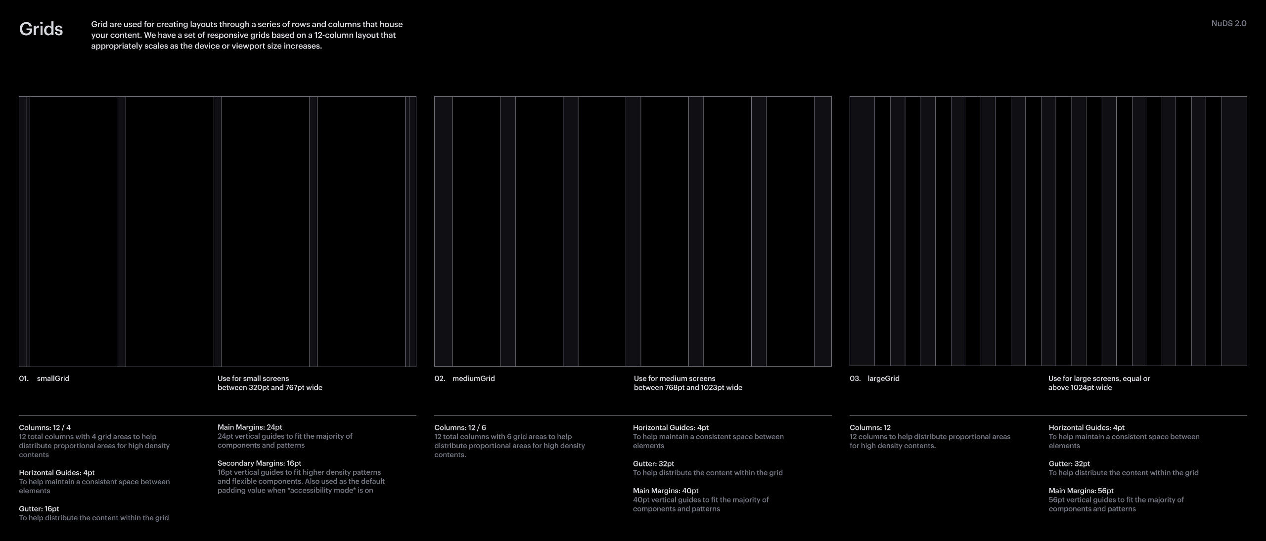
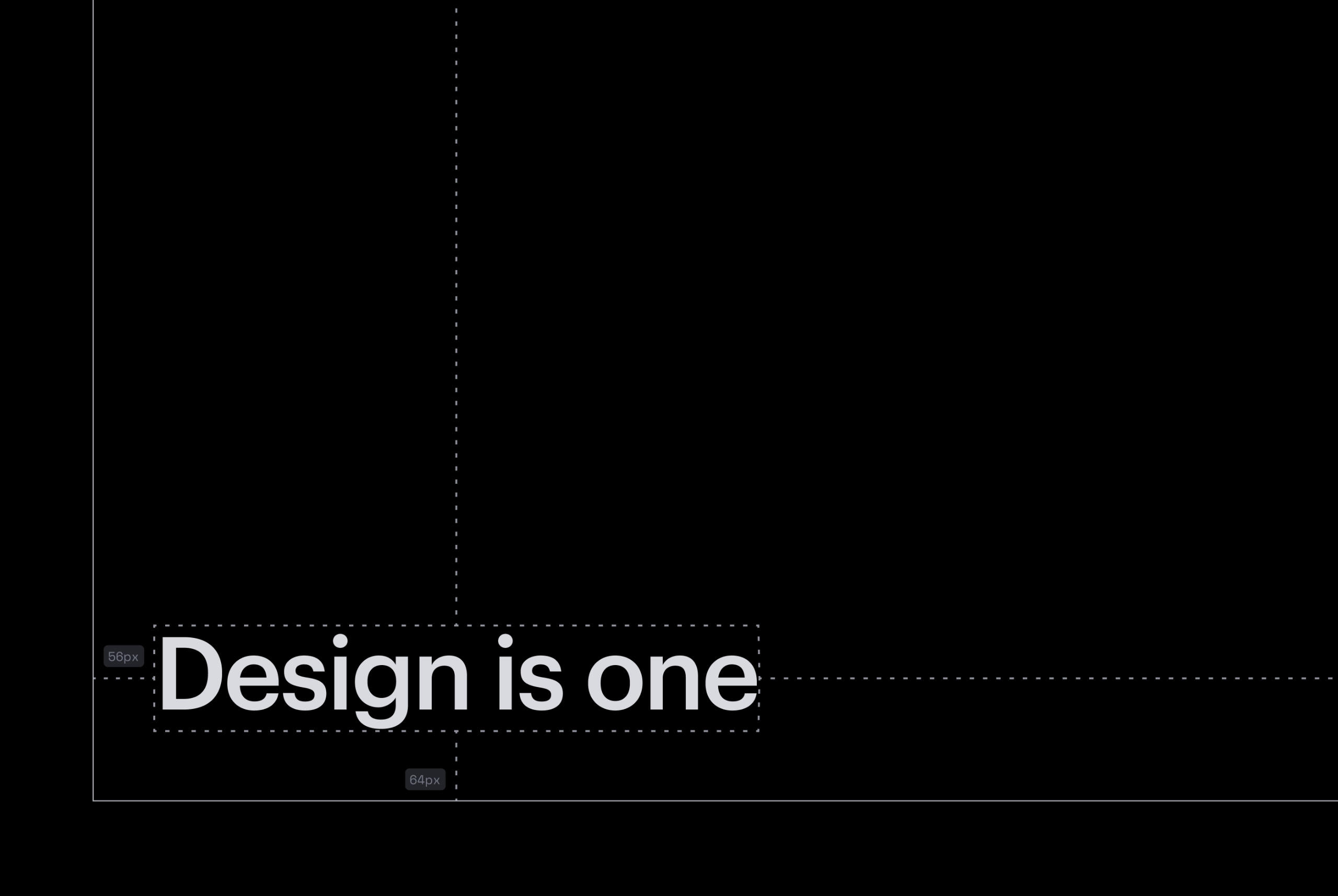
██Around Q3 of 2020, Nubank's Design System was going through a major redesign. I had the opportunity to join the team temporarily to help in the construction of the new foundation and my major contribution was a unified layout system for both applications and web pages.
3
Programmed
Templates
██After gathering all templates in the Web Kit library, I programmed their logic using auto-layout, grids, and the styles available in the Design System Core Library.
██Additionally, to make everything easier to use, I created a semantic for the templates names, so the designers could go thought the desired viewport and theme of a specific section template.
██
██Lastly, All template were filled with the Massimo Says AI, for casual inspiration.
4
How to use
██In oder to use these templates, designers should enable the Core Library, which contain the Foundation (Colors, Type styles, Grids and Icons) and the Web Kit, which contains the components, patterns and templates for creating web pages.
██
██To assemble a page, designers just have to search the name of a general category of a template (Hero, Static, Interactive or Table) and choose the preferred ones.
5
Showcase
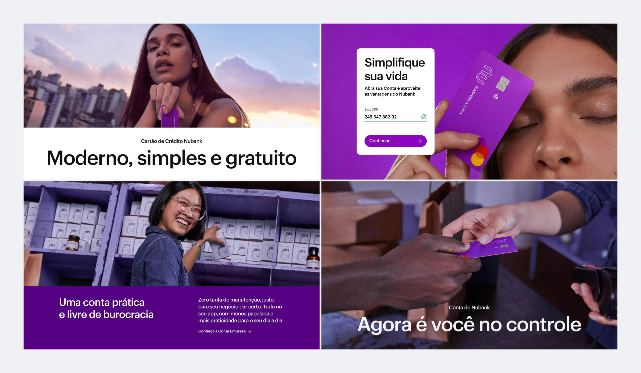
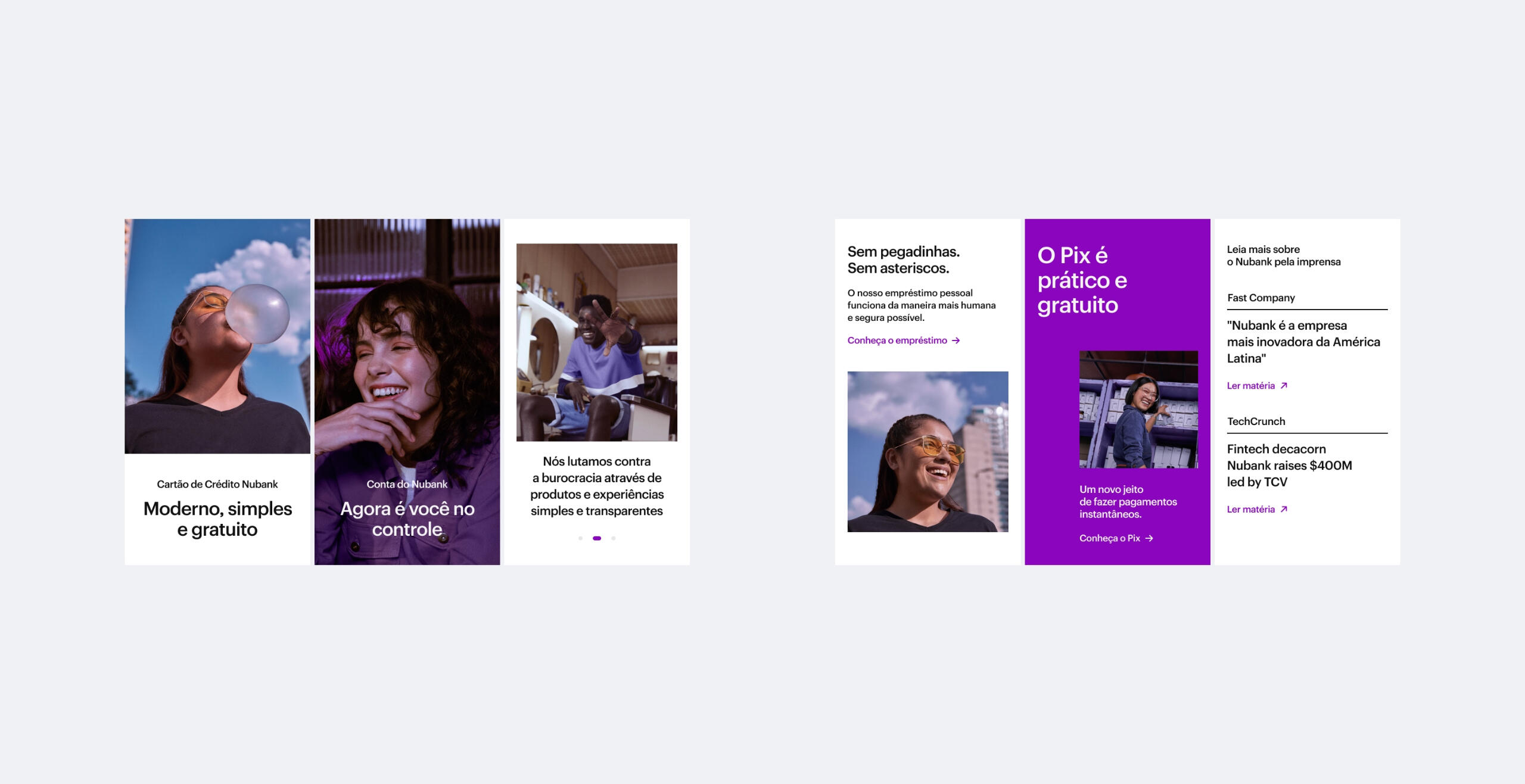
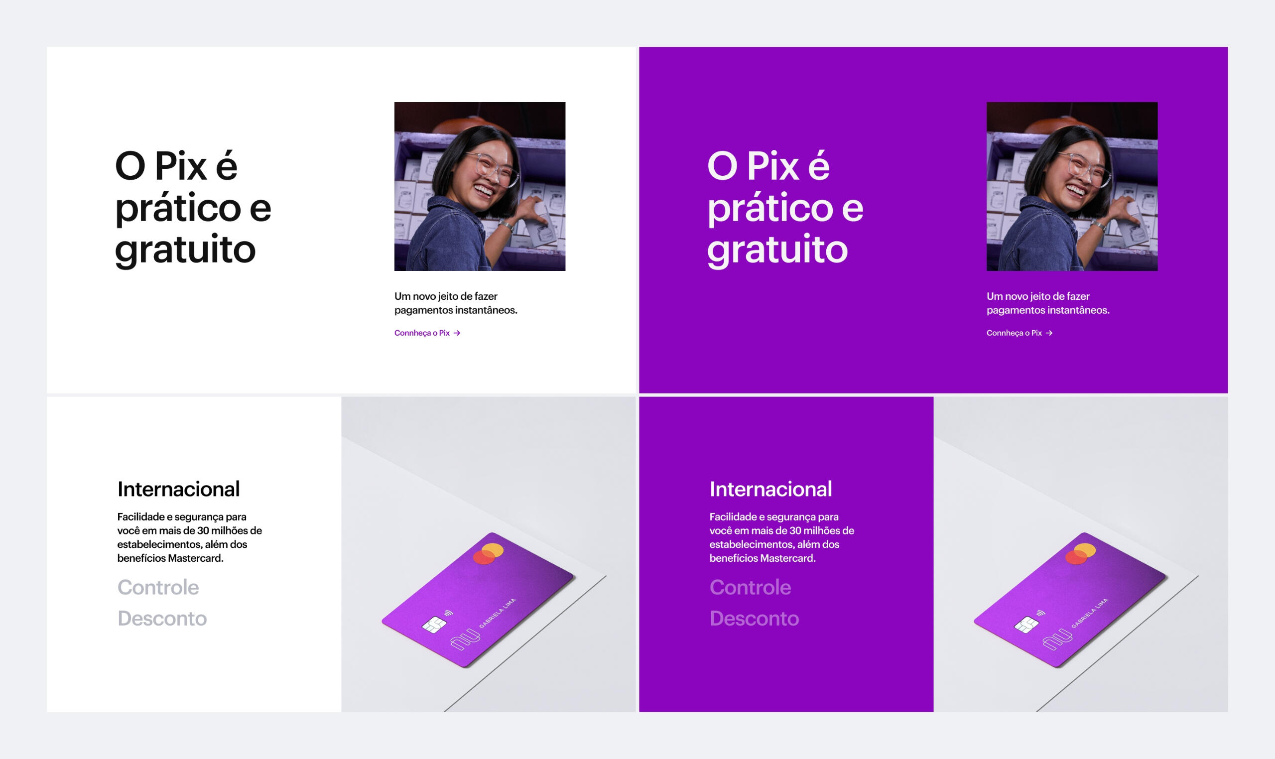
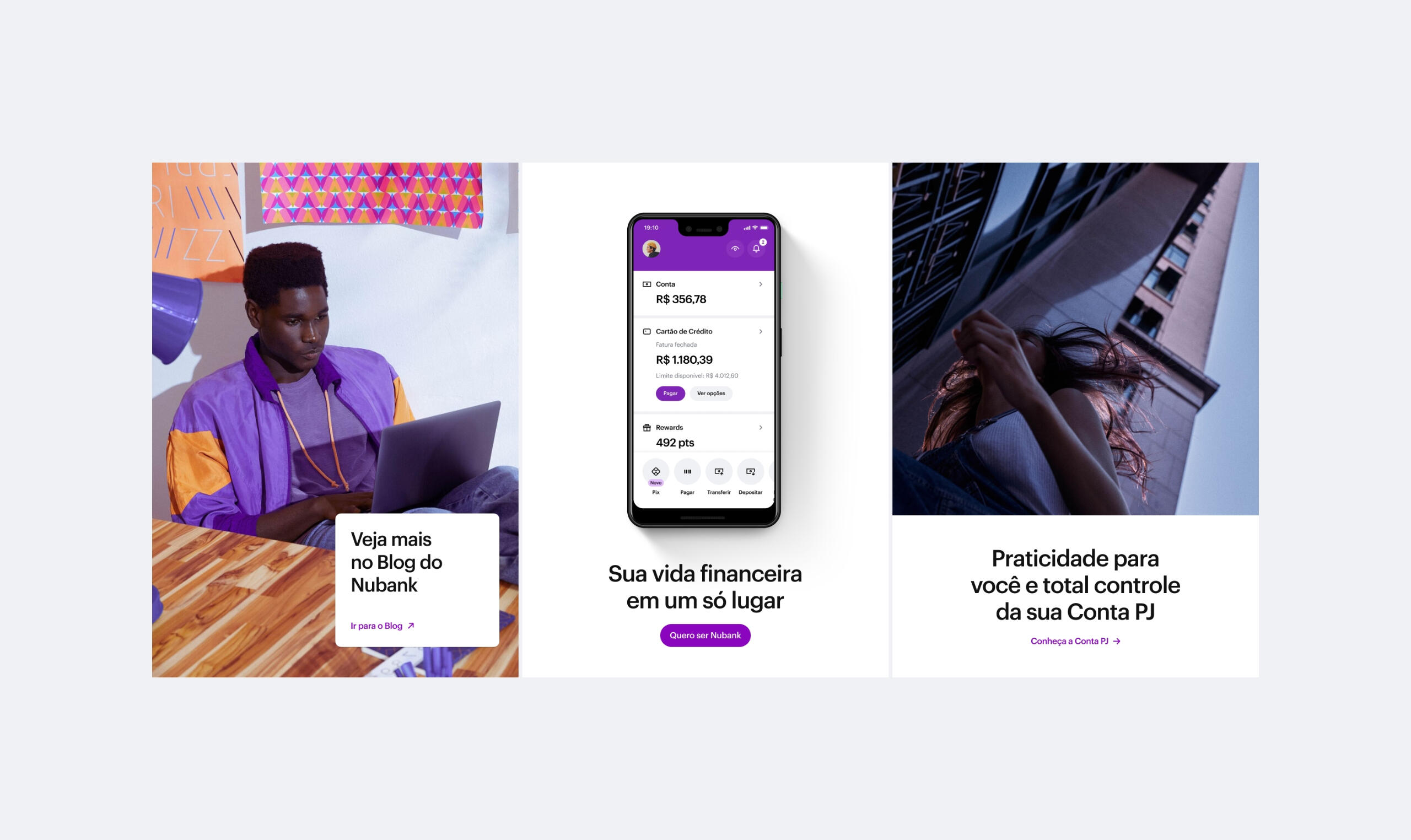
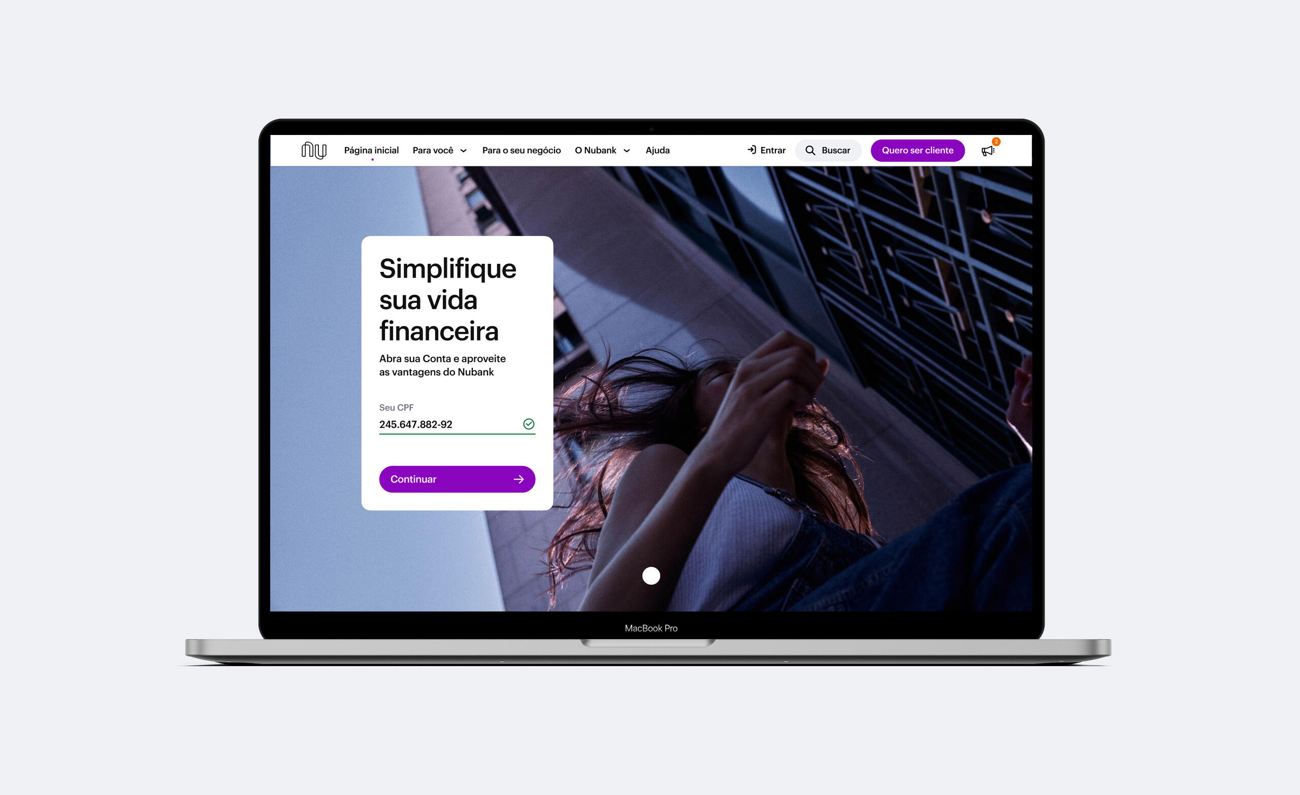
Nubank Website Arch 2021
CREDITS
Visual design & UX
Hélio Costa
Luiza Tagliatella
Paulo Assunção
Product & Data
João Cunha
Luisa Coutinho
Fernanda Monsó
Writing
Kenya Ortiz
Research
Carlos Hernández Tellez
Hélio Costa
Flavia Vecchio
Luana Abade
Alan Paschoal
CONTEXT / SCOPE
██Nubank's website converges interests of multiple stakeholders such as Acquisition, Product Squads, Branding, Marketing, People, Legal, Ops, Regulatory, among many others.
██For the past years, the amount of content in the website has increased exponentially without having a long term architecture to properly accommodate everything, resulting in a scattered experience. It got to a point that the current/old architecture wasn't supporting Nubank's growth anymore, even when we made very conservative forecasting exercises.
██Beyond that, since the assemble of my team, in late 2018, we had never talked with our users and had no clue of what the experience of the website should really be at this point.
██This was my first time dealing with architecture for a digital product, so I started looking for readings to broaden my perspective on the subject. I ended up finding a very interesting manifesto on web design as architecture written by Malte Müller. This material helped me realise that I could go beyond a simple redesign by providing atmospheric context and asking new aesthetic questions within Nubank's design language.
PROCESS
██1. Partial diagnostic: gather problems we already know that need to be addressed such as product portfolio scalability.██2. Early design experiment: explore new patterns and solutions to address these problems.██3. Research: in-depth interviews.██↳ Understand our users: who they are, their mental models, navigations patterns, bank relationships and overall preferences.██↳ Card sorting with website content.██↳ Real time navigation with the production website.██↳ Debriefing sessions and documentation.██4. Iterate on the early experiments: Incorporate the research findings. Design and test a new version with the users.██5. Rollout strategy: Lay down a roadmap for 2021 with clear phases and KPIs, prioritizing the production based on users and business needs from high to low.
1
Improving content
findability and hierarchy
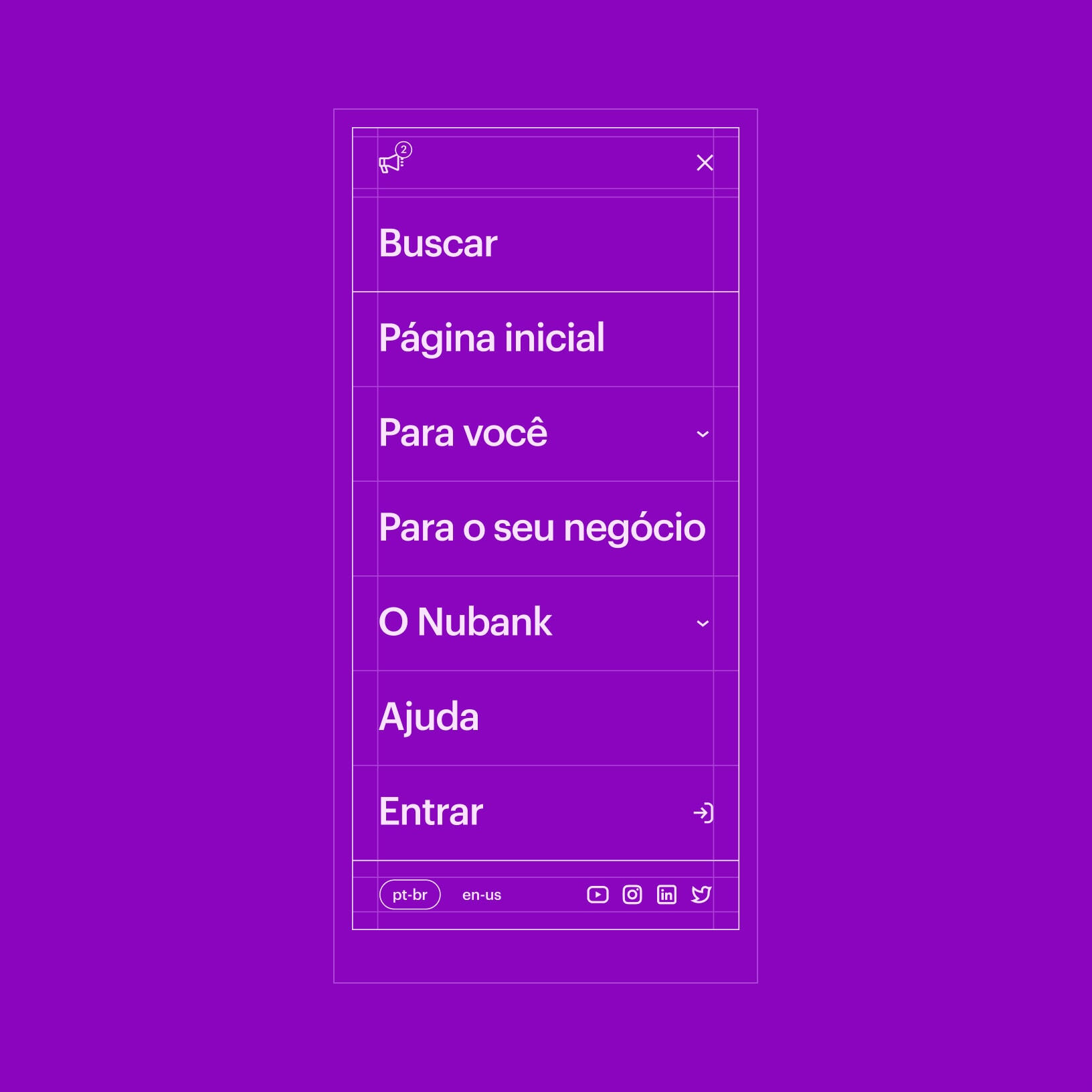
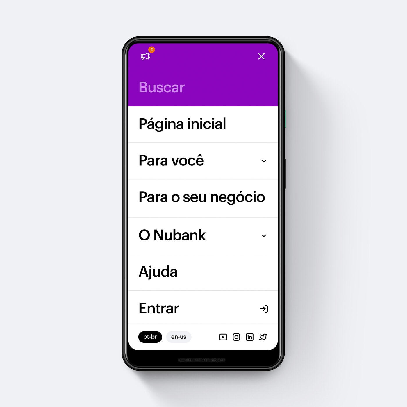
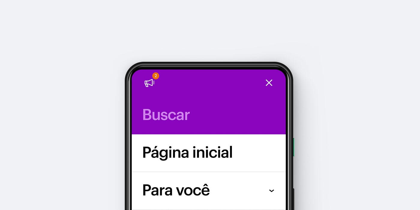
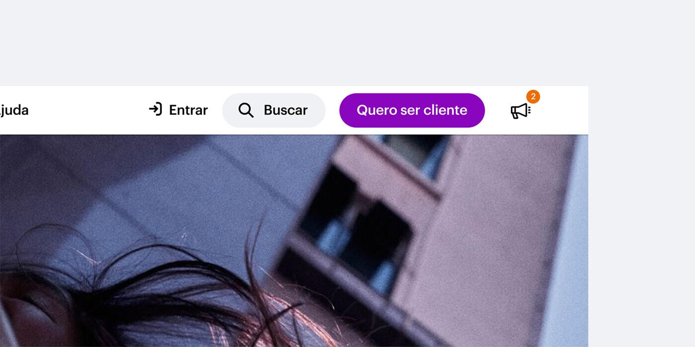
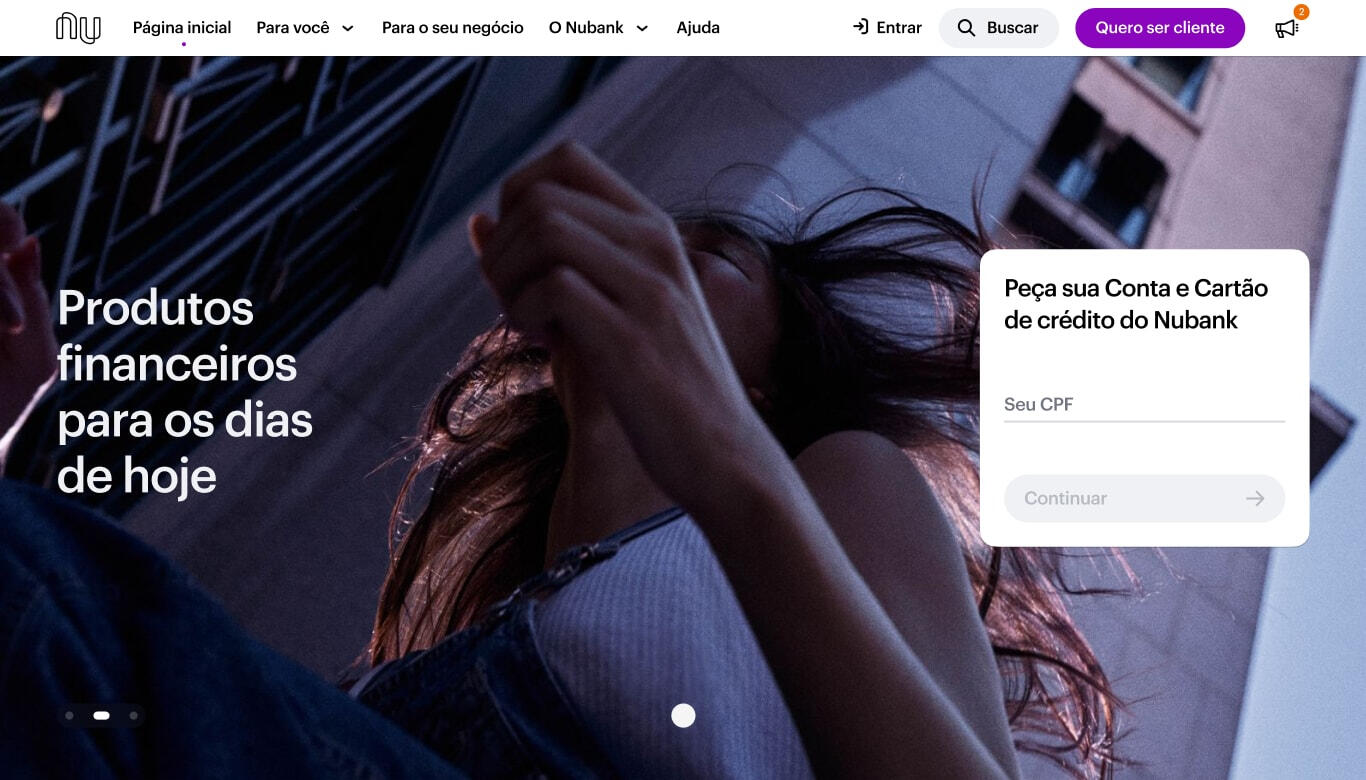
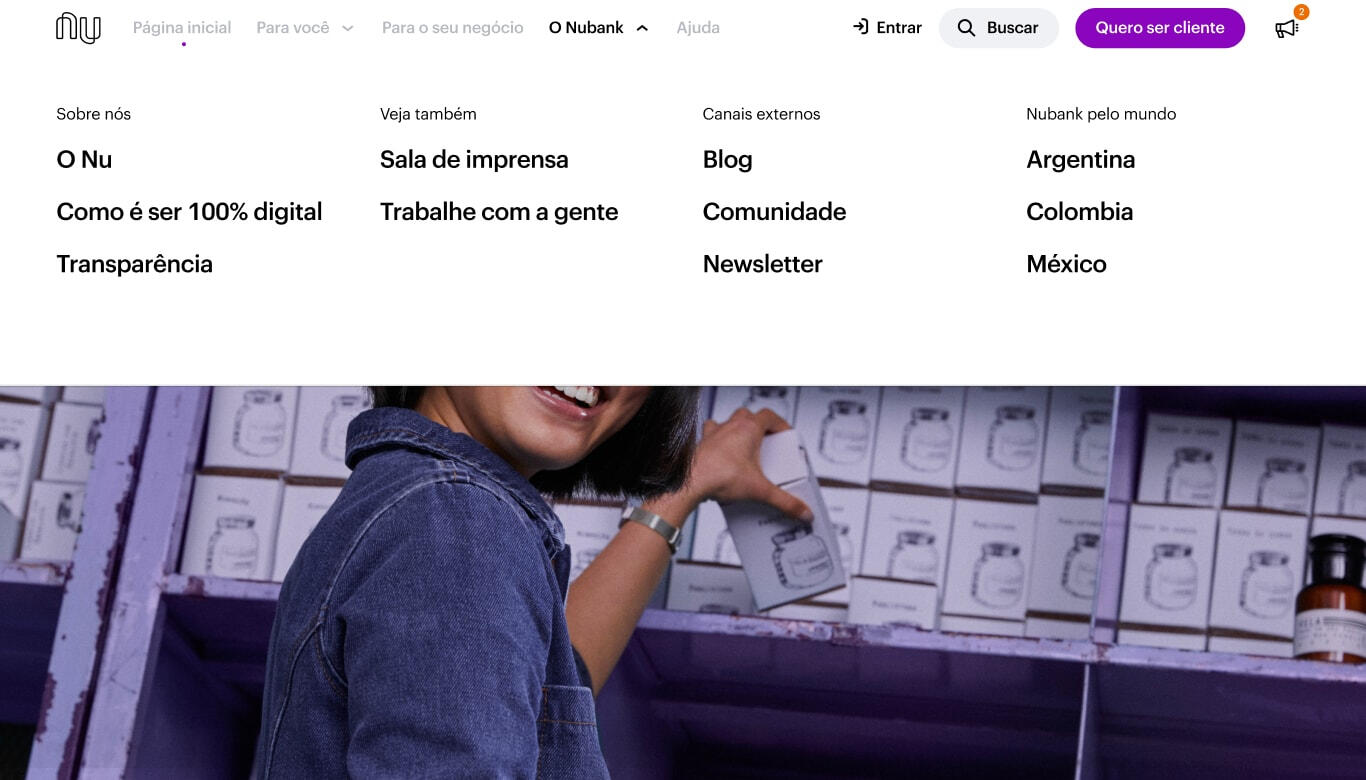
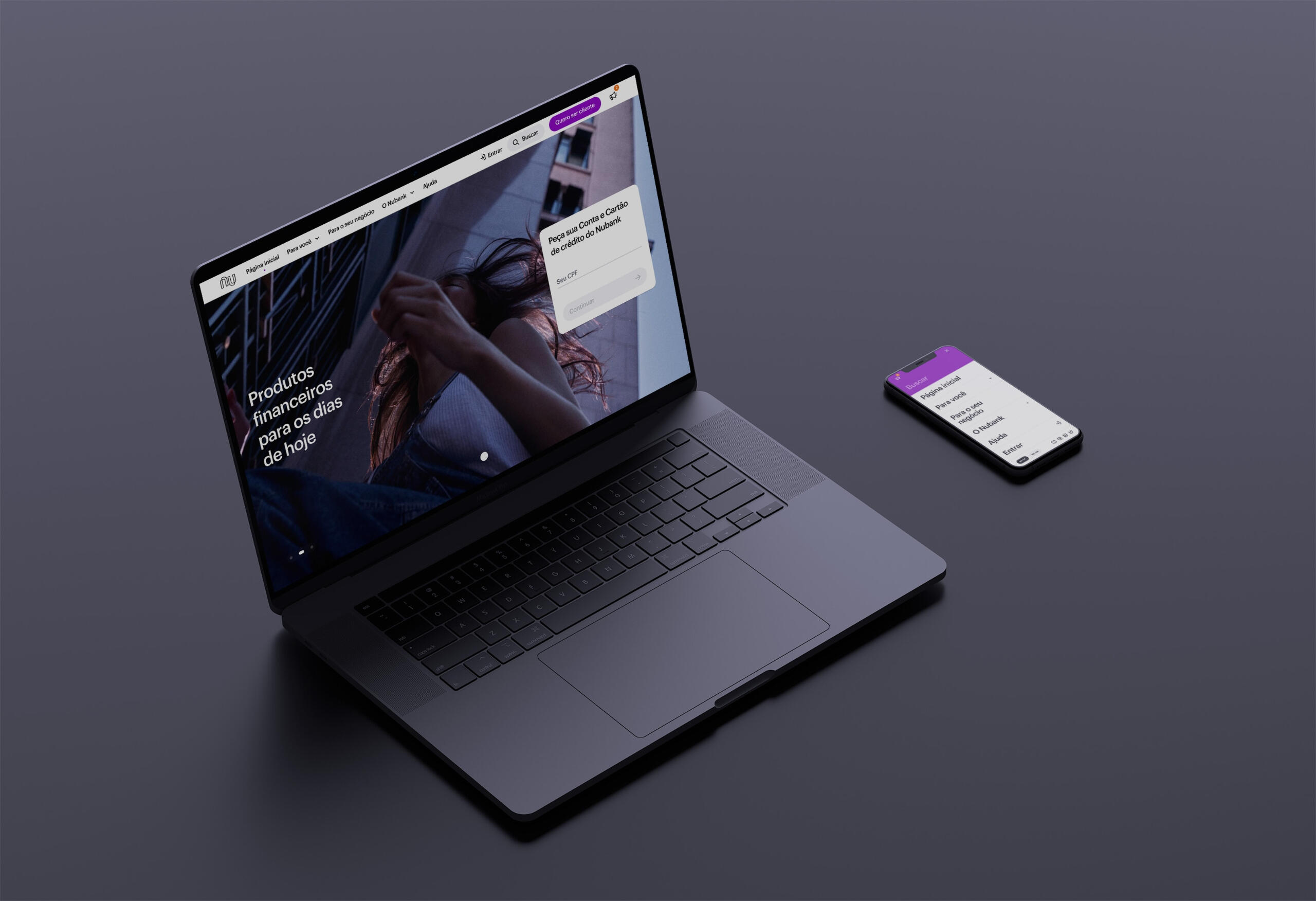
██Navigation: All content is grouped in 4 major categories - "For you", "For your business", "Nubank" and "Help".
██
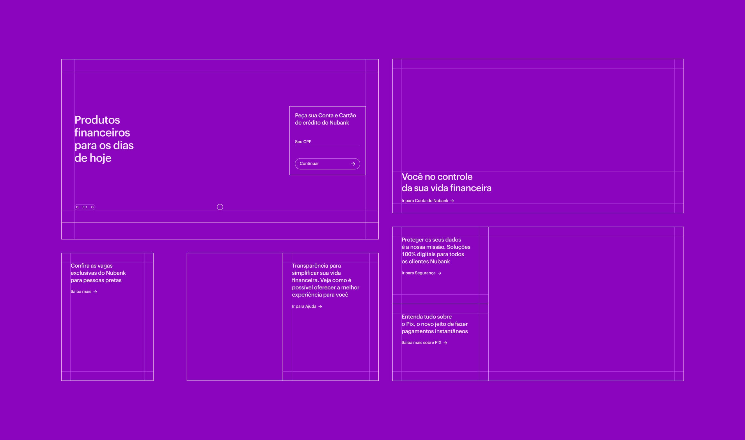
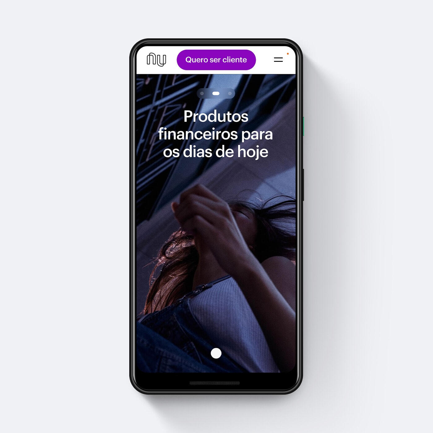
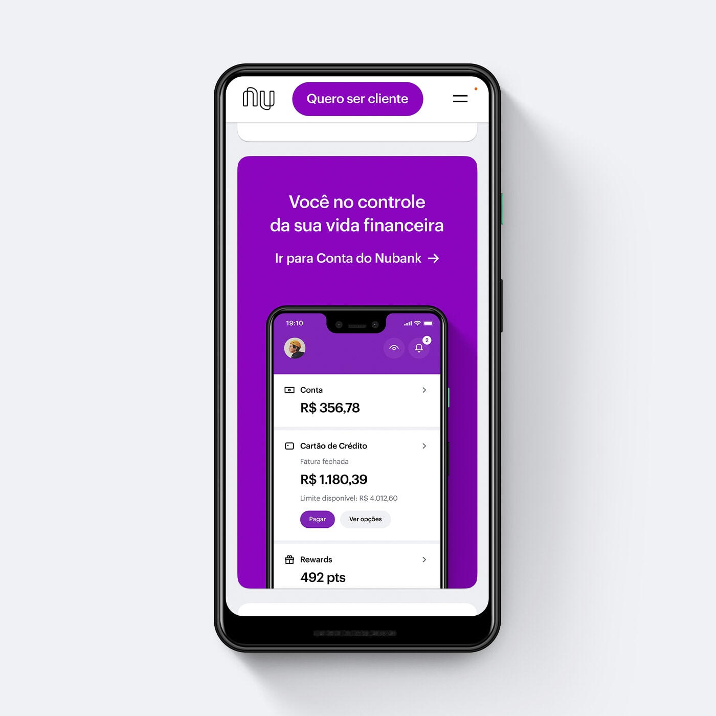
██Homepage: Modular design with up to 4 levels of hierarchy for multiple content placement.
██
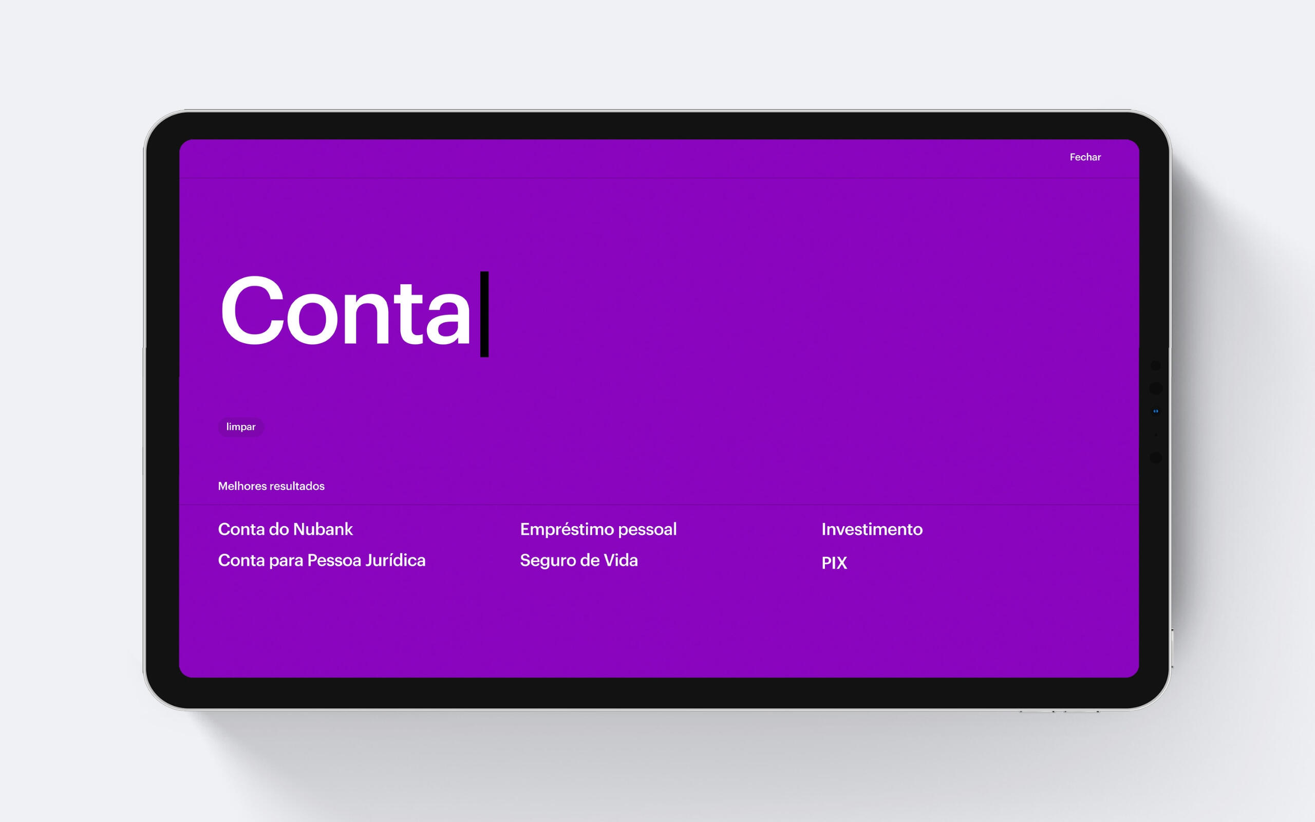
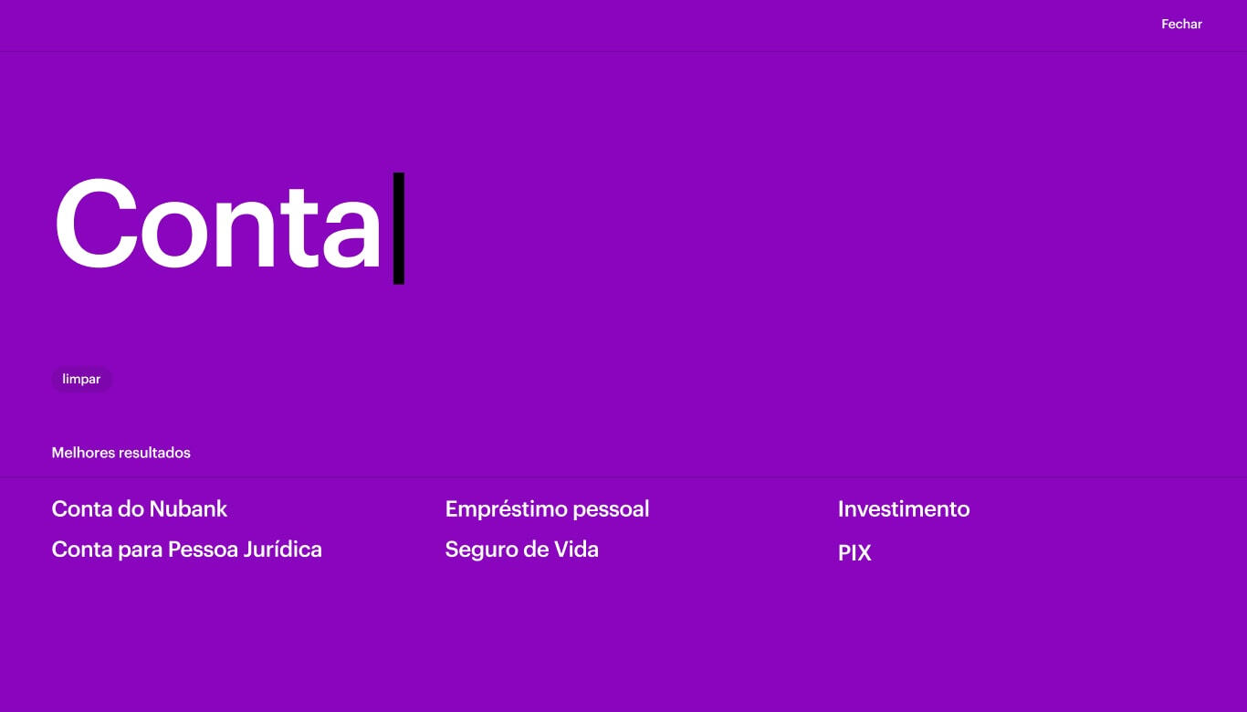
██Search: Users can search for any term and jump to the content they are seeking faster.

2
Expanding the
application experience
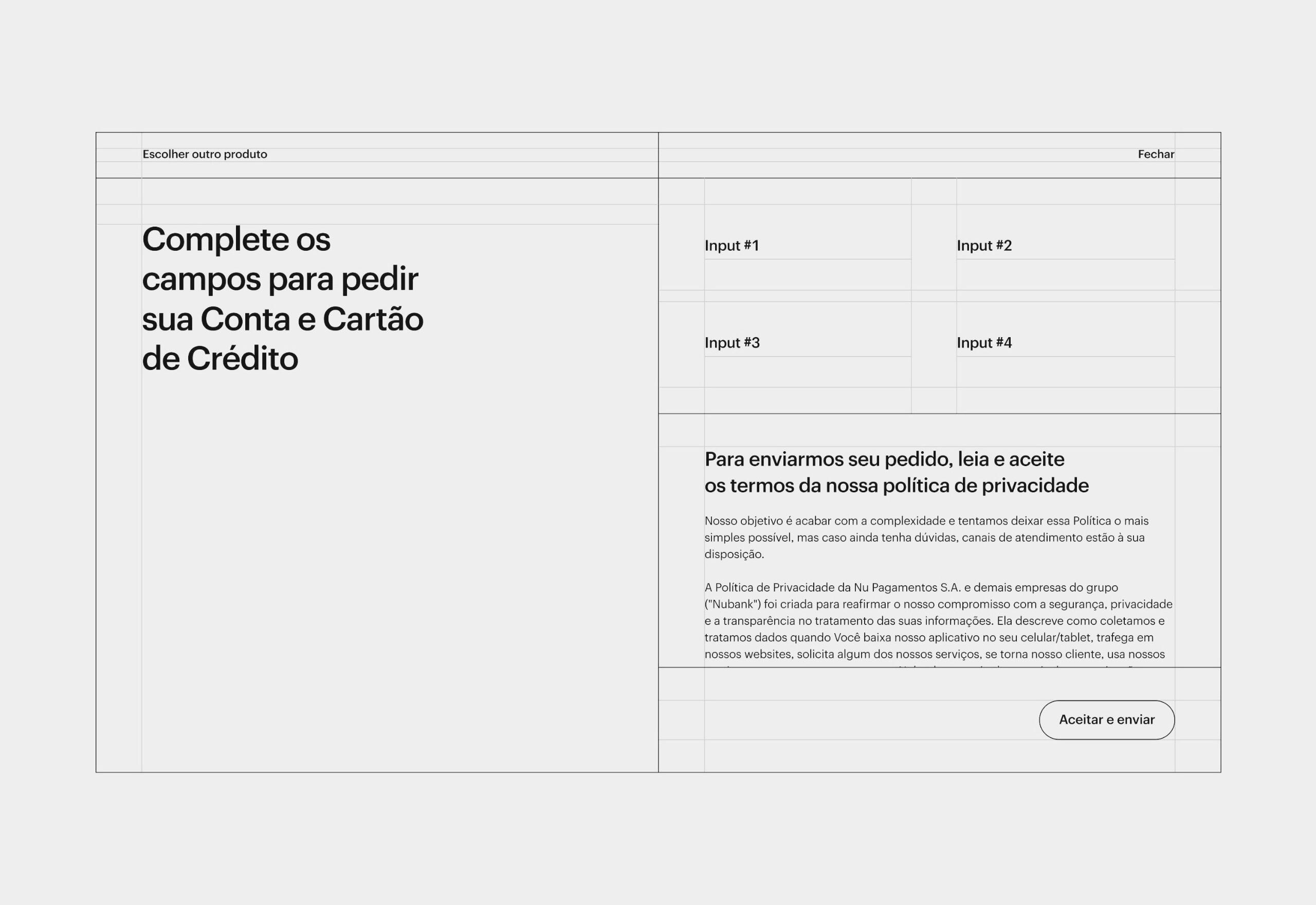
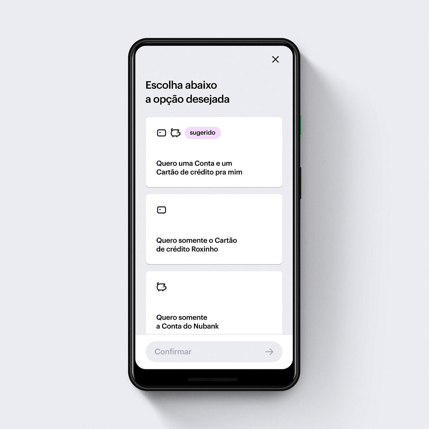
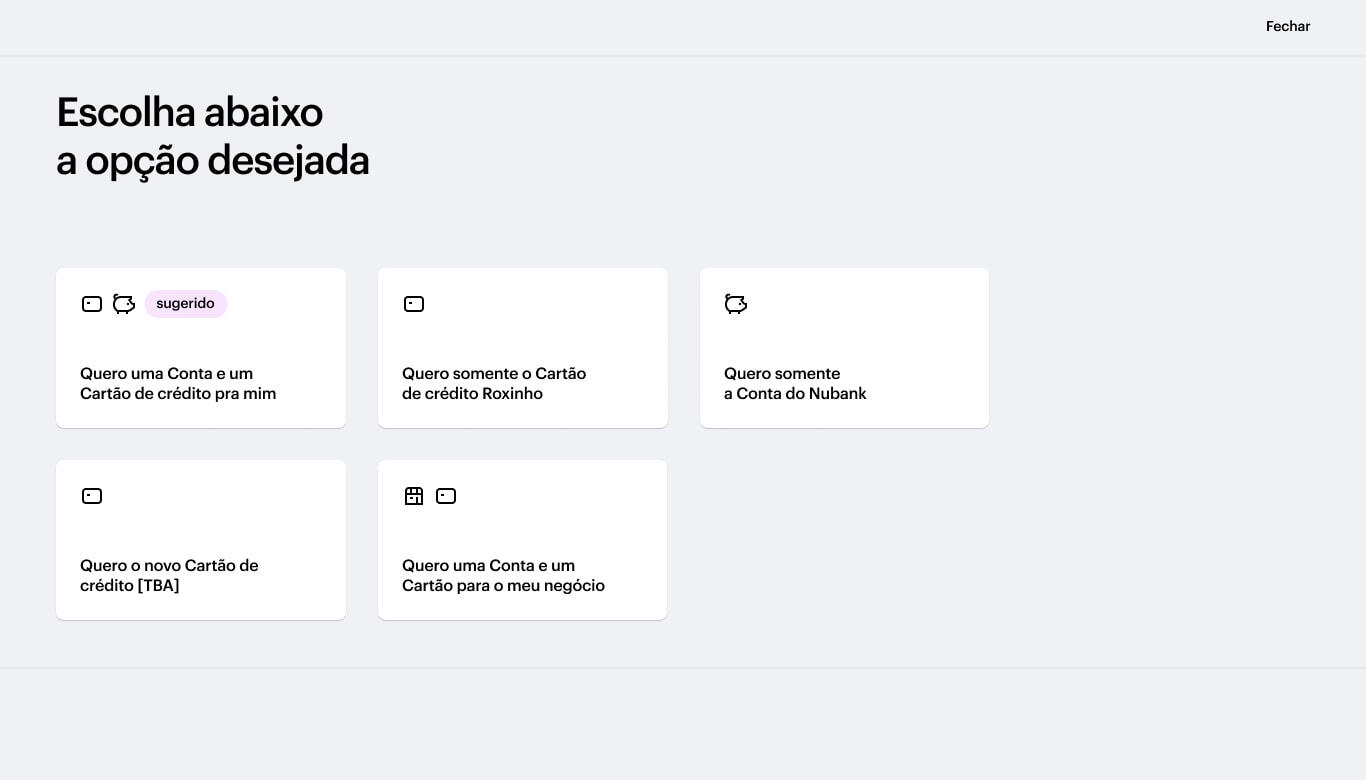
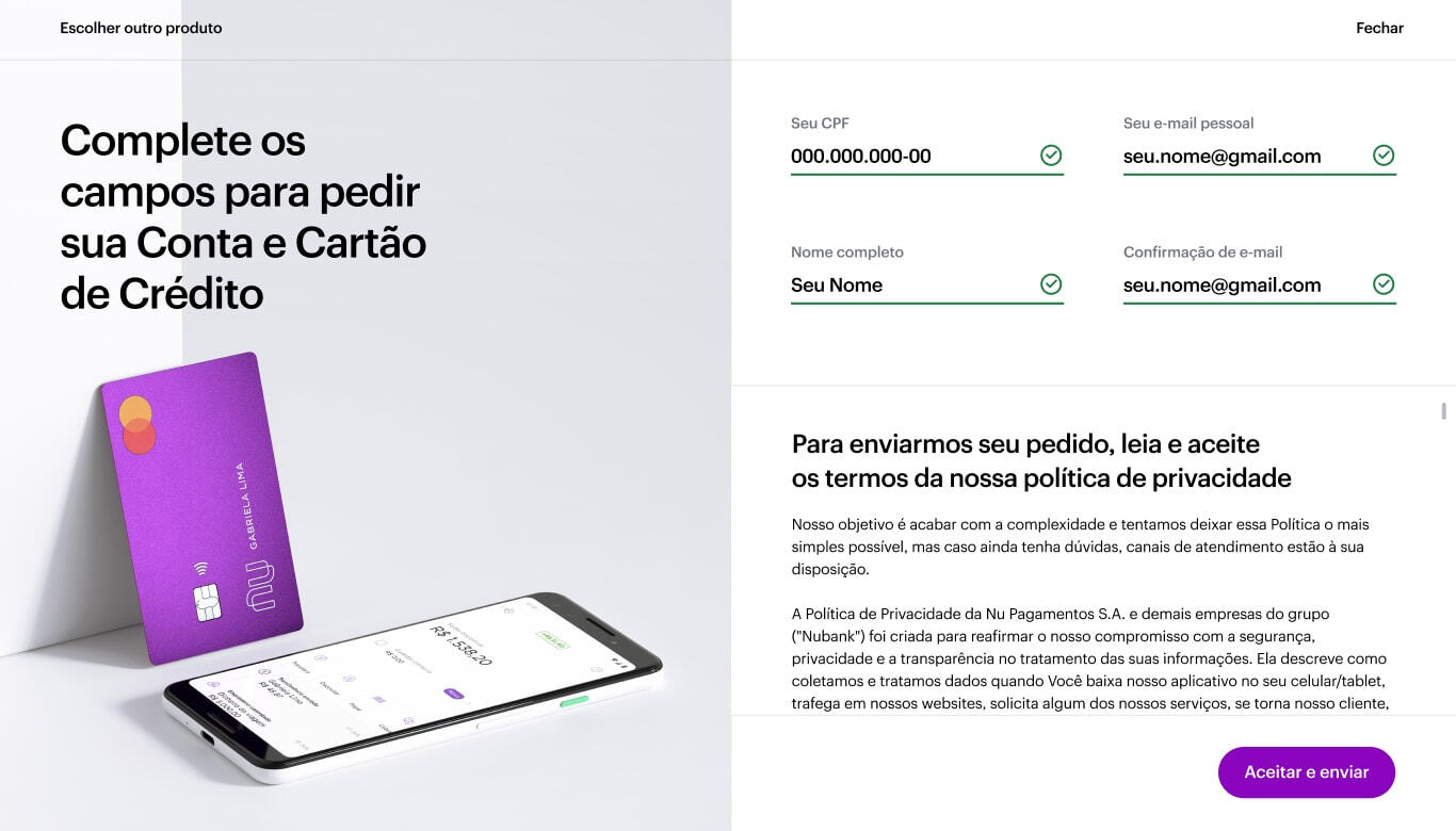
██Product selection: Users can select bundles or individual products to apply for from anywhere in the website.
██
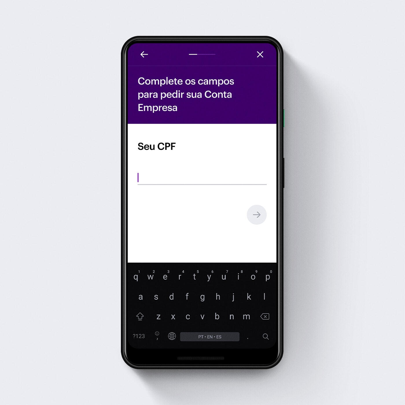
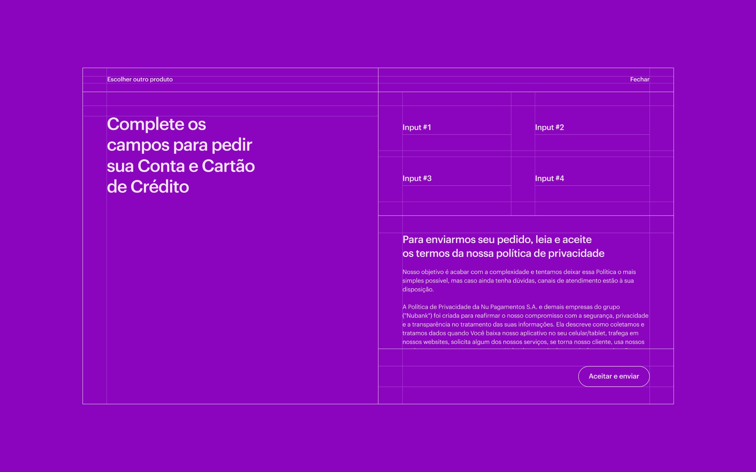
██Contextual application: The application flow provide a visual context of the product or bundle the user chooses to apply for.
██
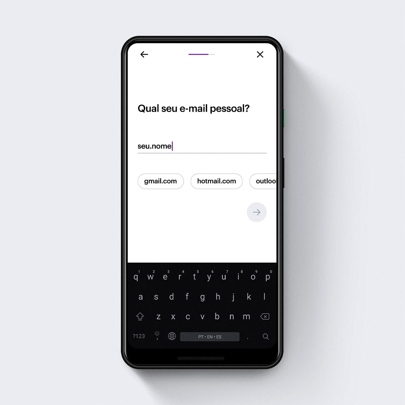
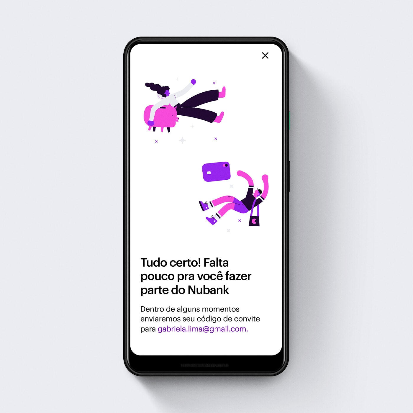
██Application experience: Application now uses a full progressive disclosure pattern on mobile, allowing the user to go through the flow facing minimum cognitive load.
3
Making announcements
more distinct and scalable
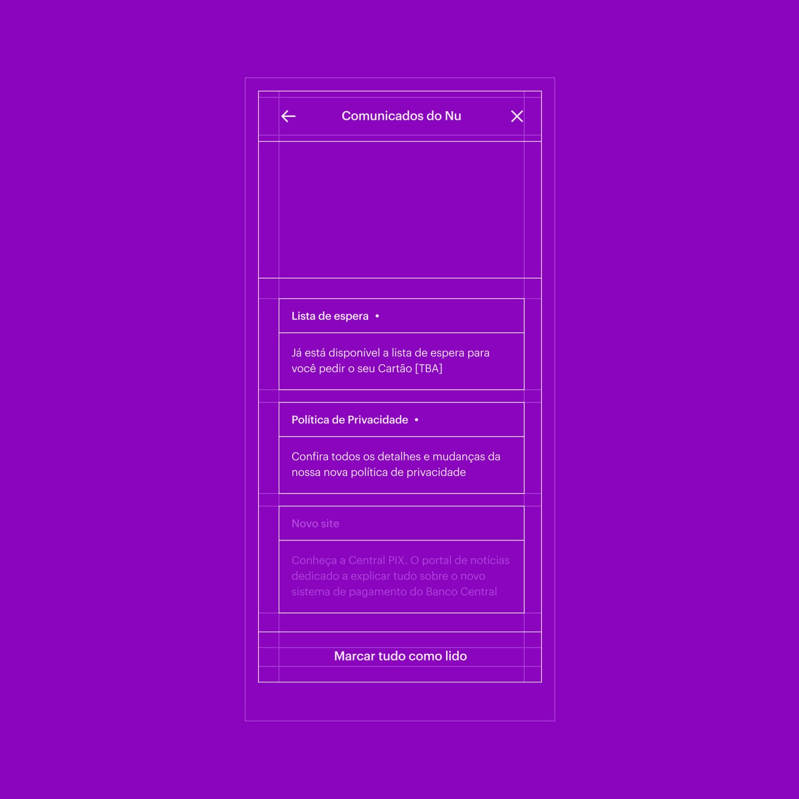
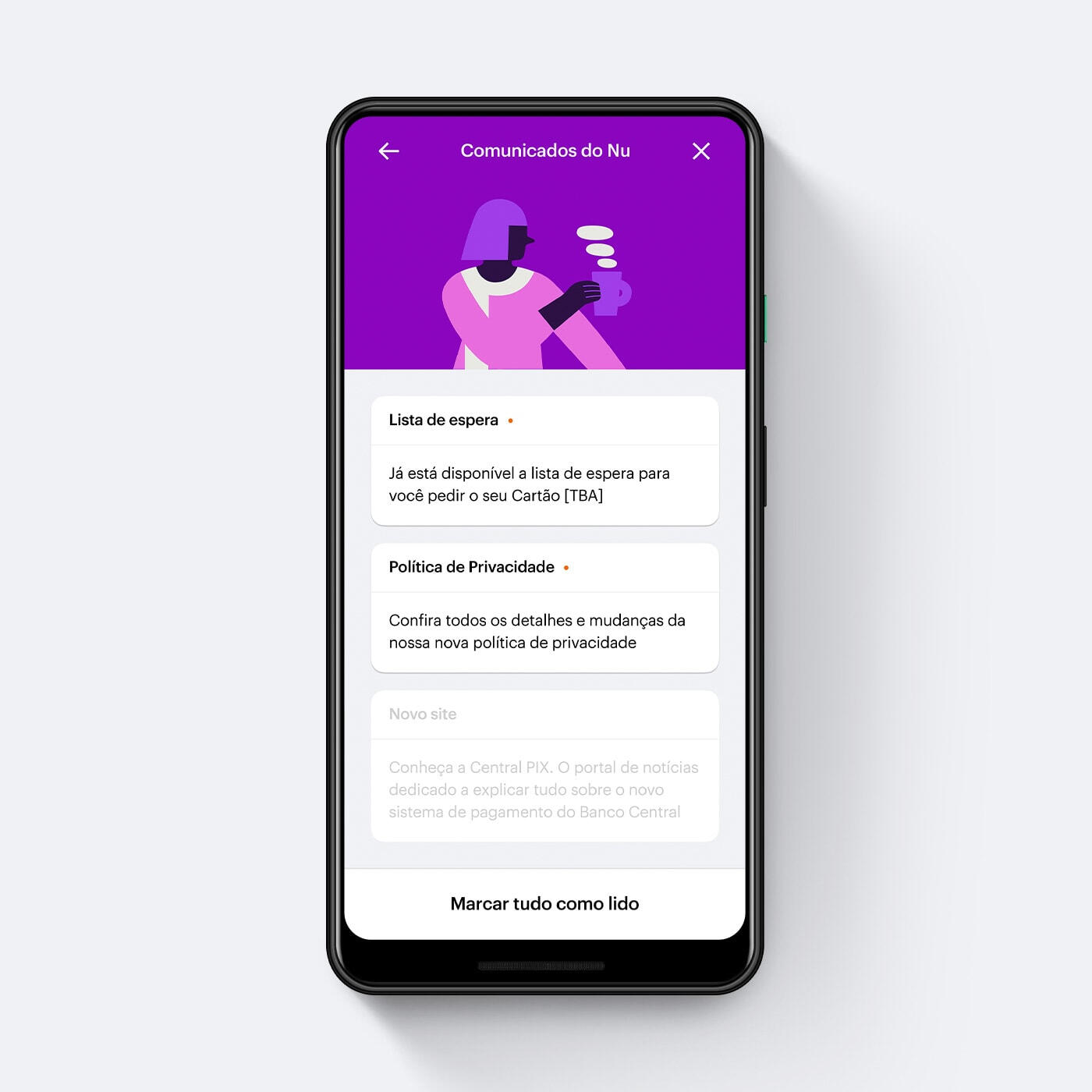
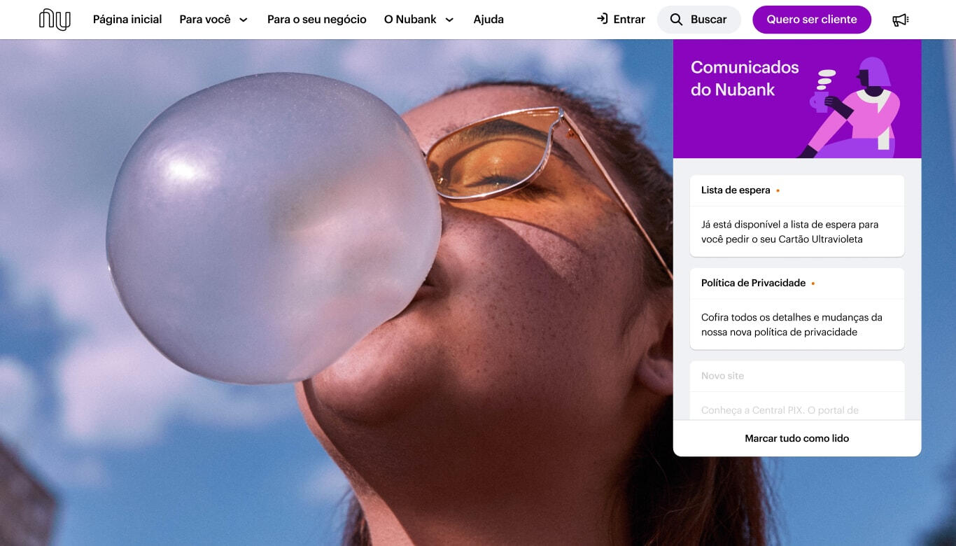
██The previous announcement bar was replaced for a new, less disruptive pattern. The new area now support multiple announcements and keeps previously dismissed notifications.
All new "rooms"
4
Usability test
quotes
"(...)Very easy to identify and solve any kind of problem or open an account."
"The website is very funcional, fluid and precise. It caters all types of people."
"Visually, it's very good. The pictures, everything. It's very pretty."
"It's right in your face what Nubank tries to offer: practicality and simplicity for doing things."
"I liked it. It feels very organized. There is a lot of stuff but it doesn't pollute."
"Simple. Intuitive.(....)I can find everything I need here".
"Very practical to find stuff, right? You can just go here and search for it."
"Congrats. There is a lot of information and a lot of functionalities."
Attlas
2022
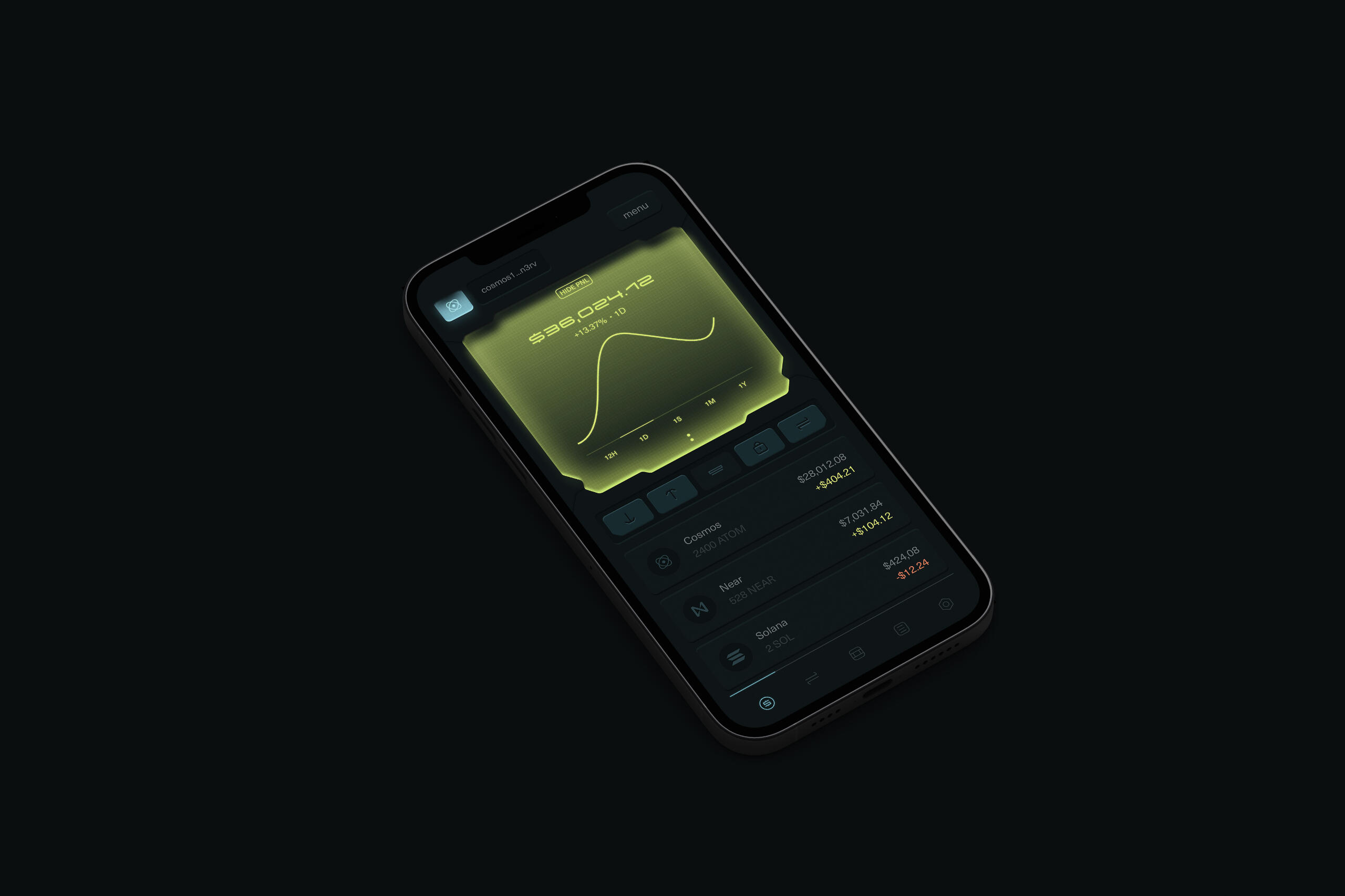
Crypto wallet POC
for the Cosmos blockchain
This case is locked for better
IP protection. Please ask
access at [email protected]
Dark Futur
Description
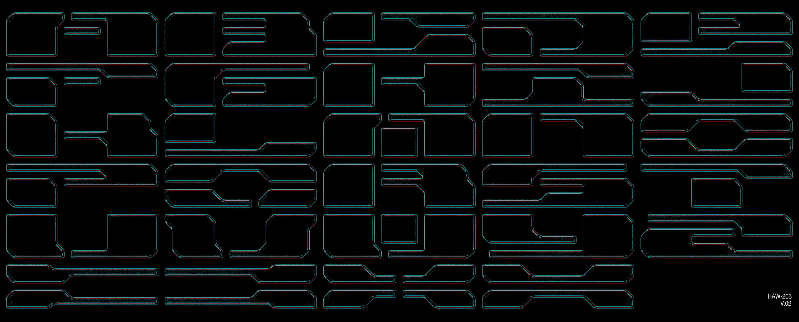
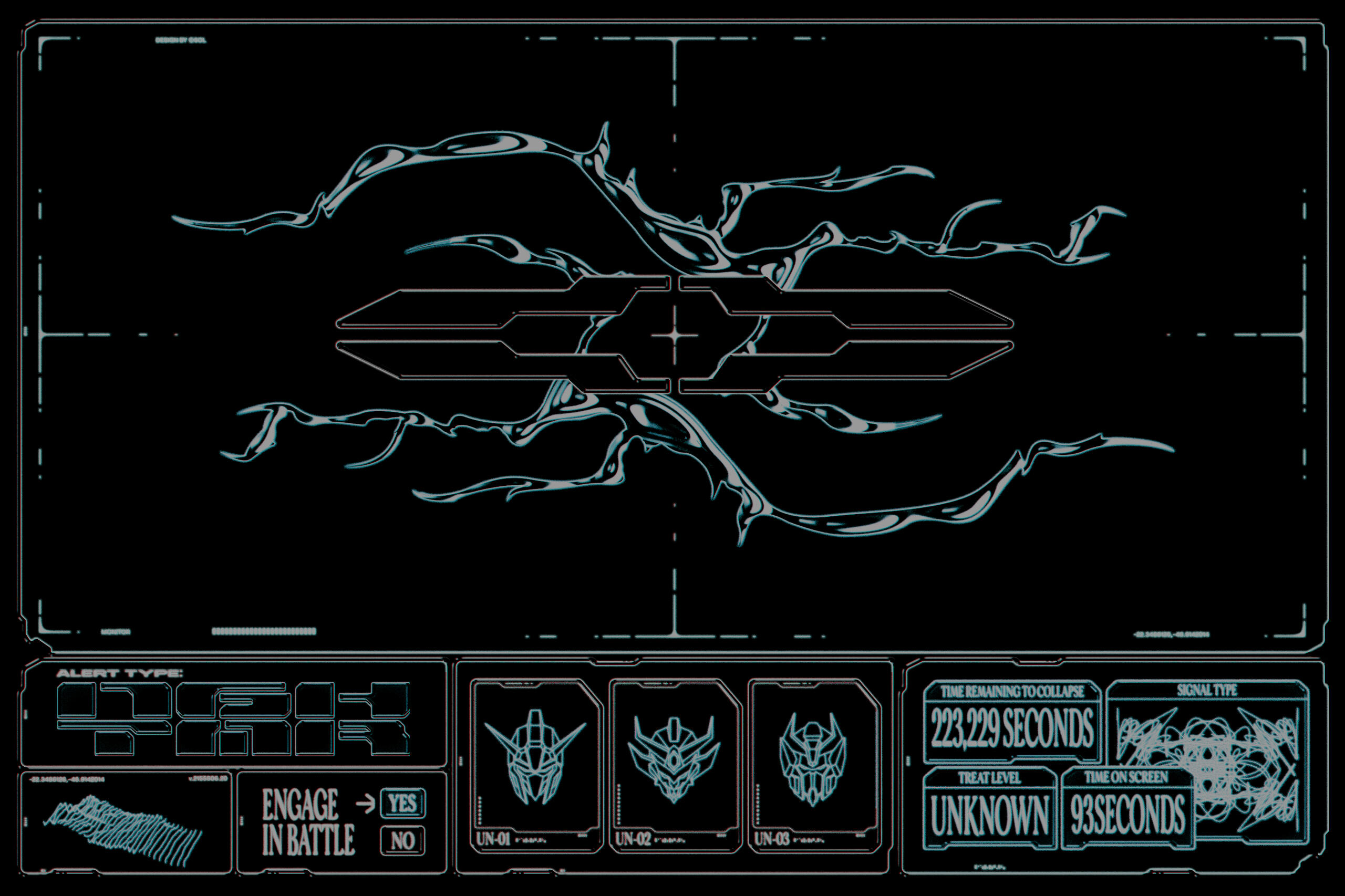
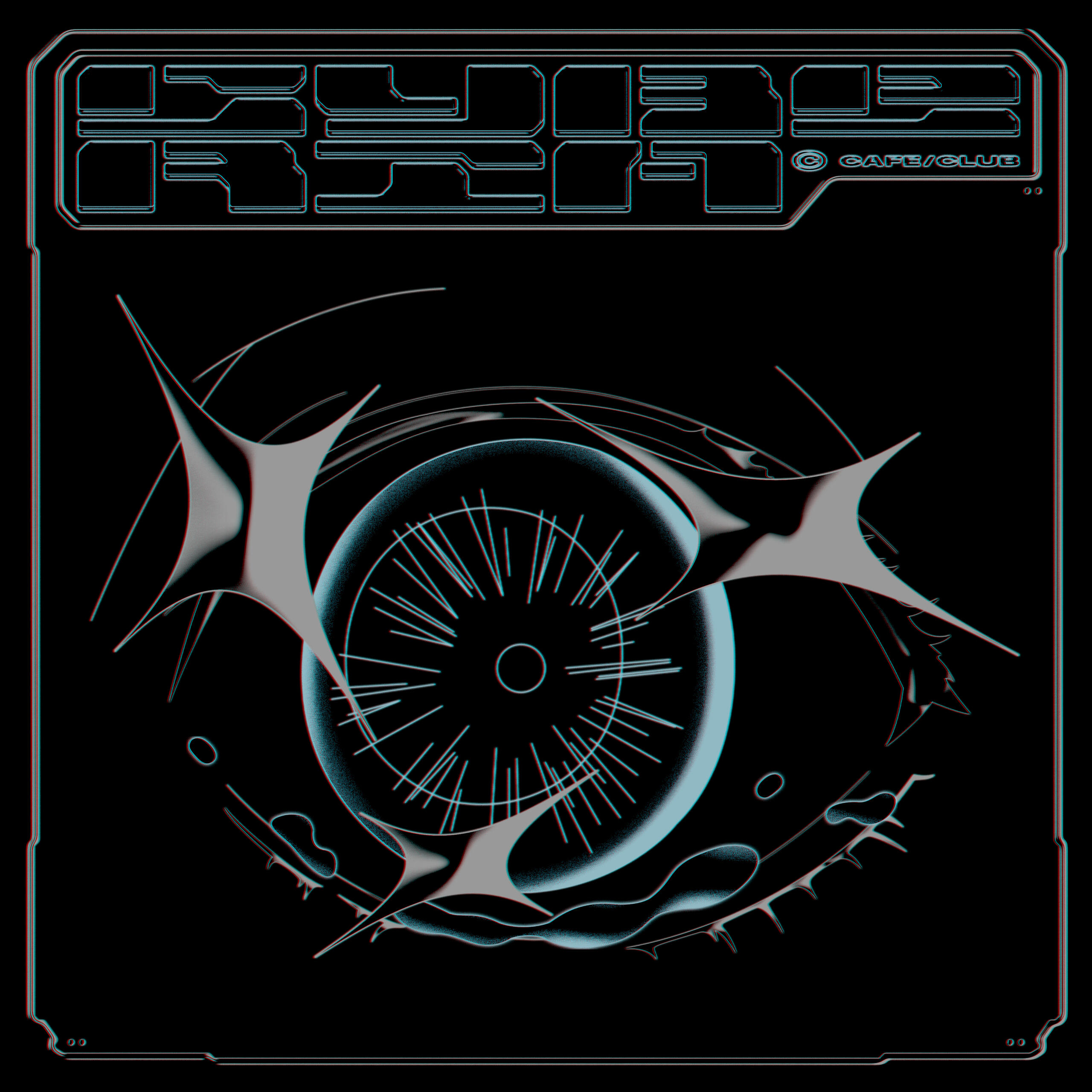
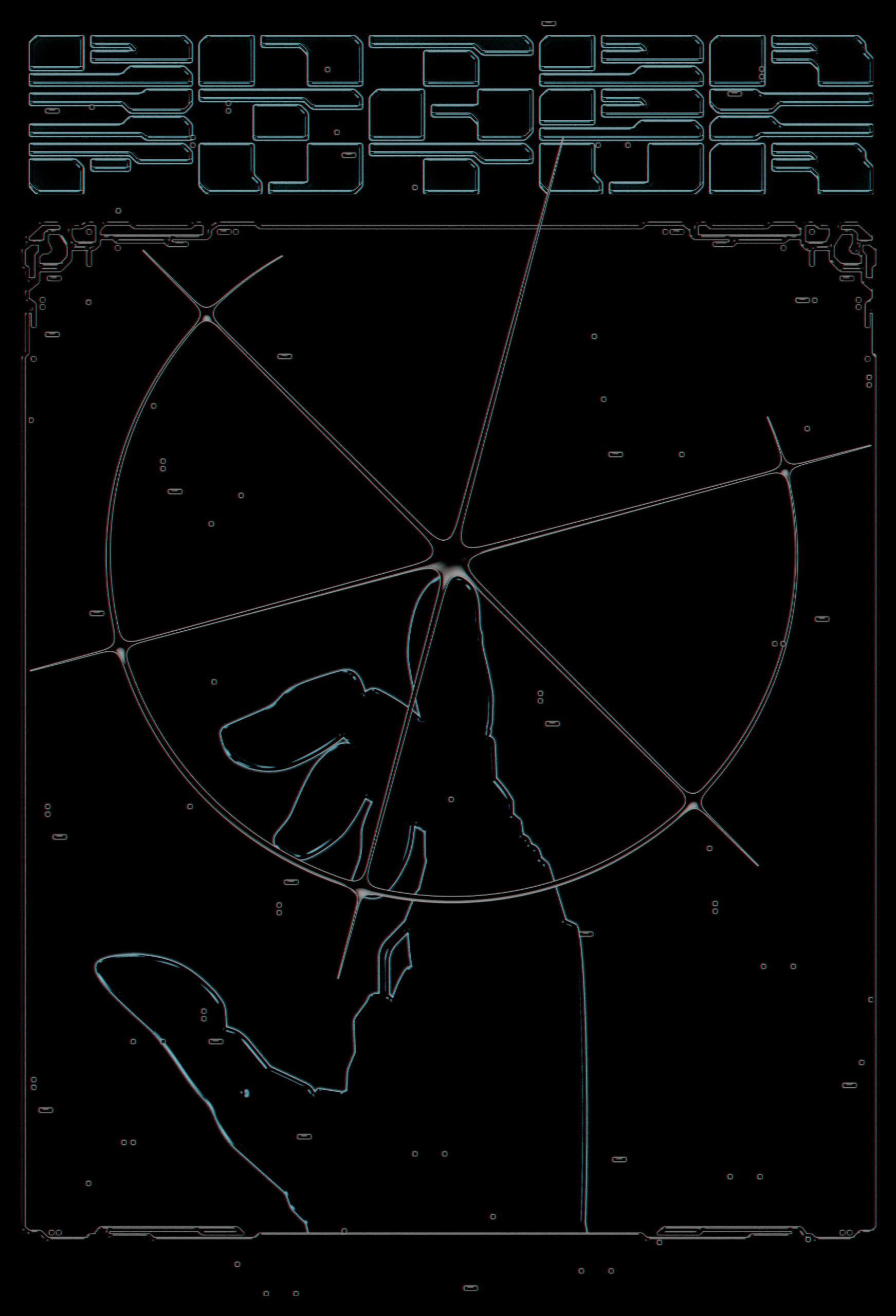
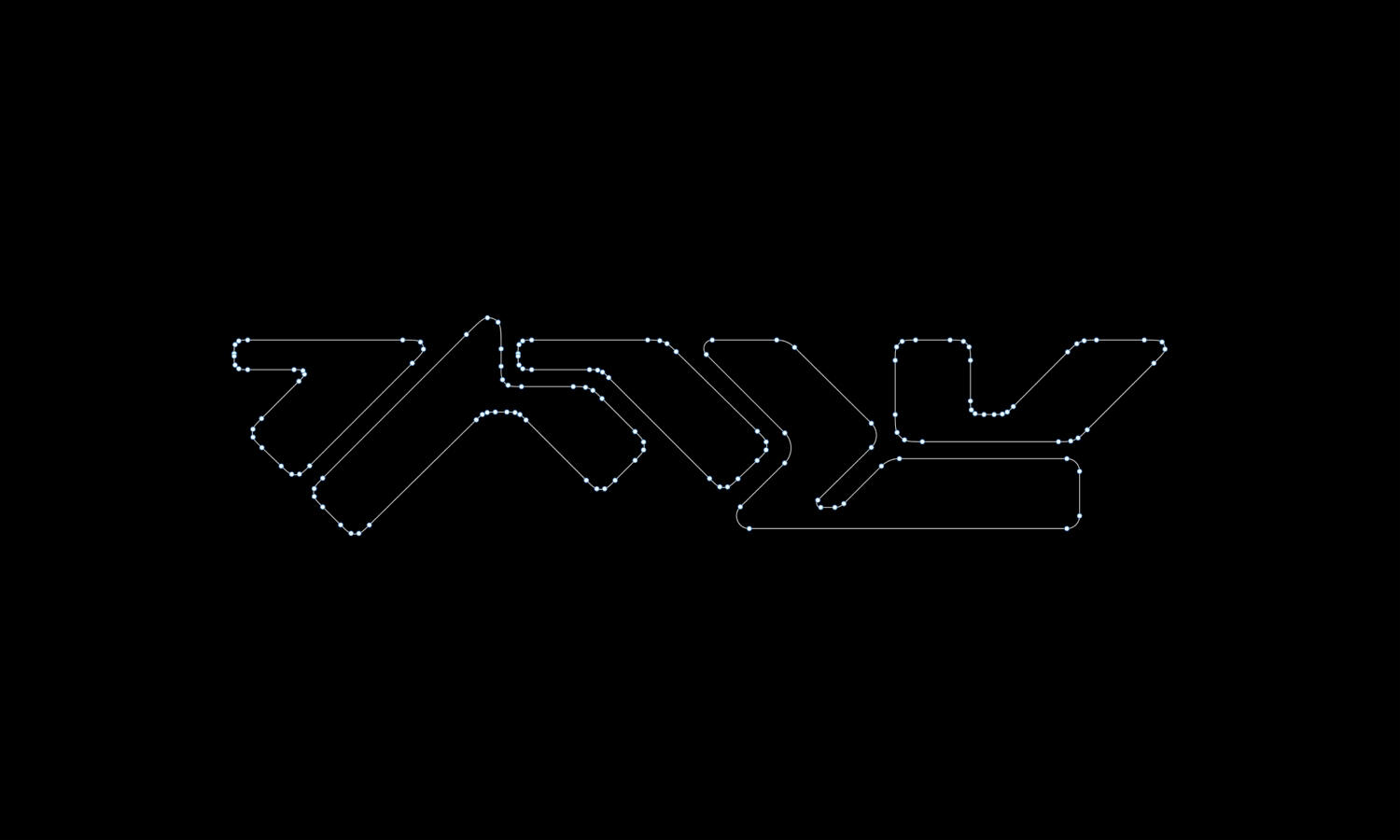
██Dark Futur is an ever-evolving, unbounded, worldbuilding exercise which the sole purpose is to play with post-human aesthetics.
Work type
▪ World-building
▪ Typography
EX 001.
Type 1:
HAW-206 V2
Showcase
Next: 2020 Cover Artworks →
Cover Art Commissions 2020
Track name
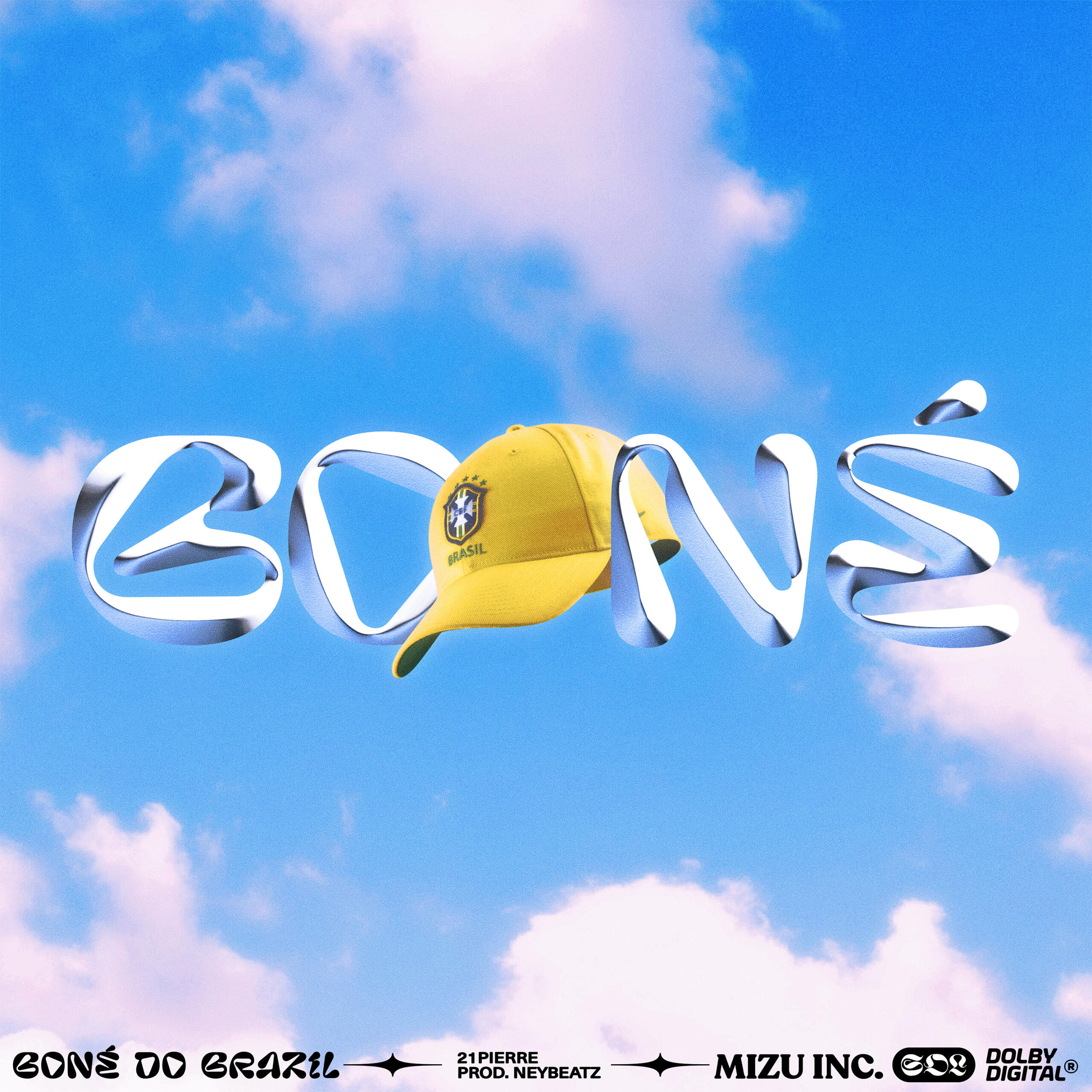
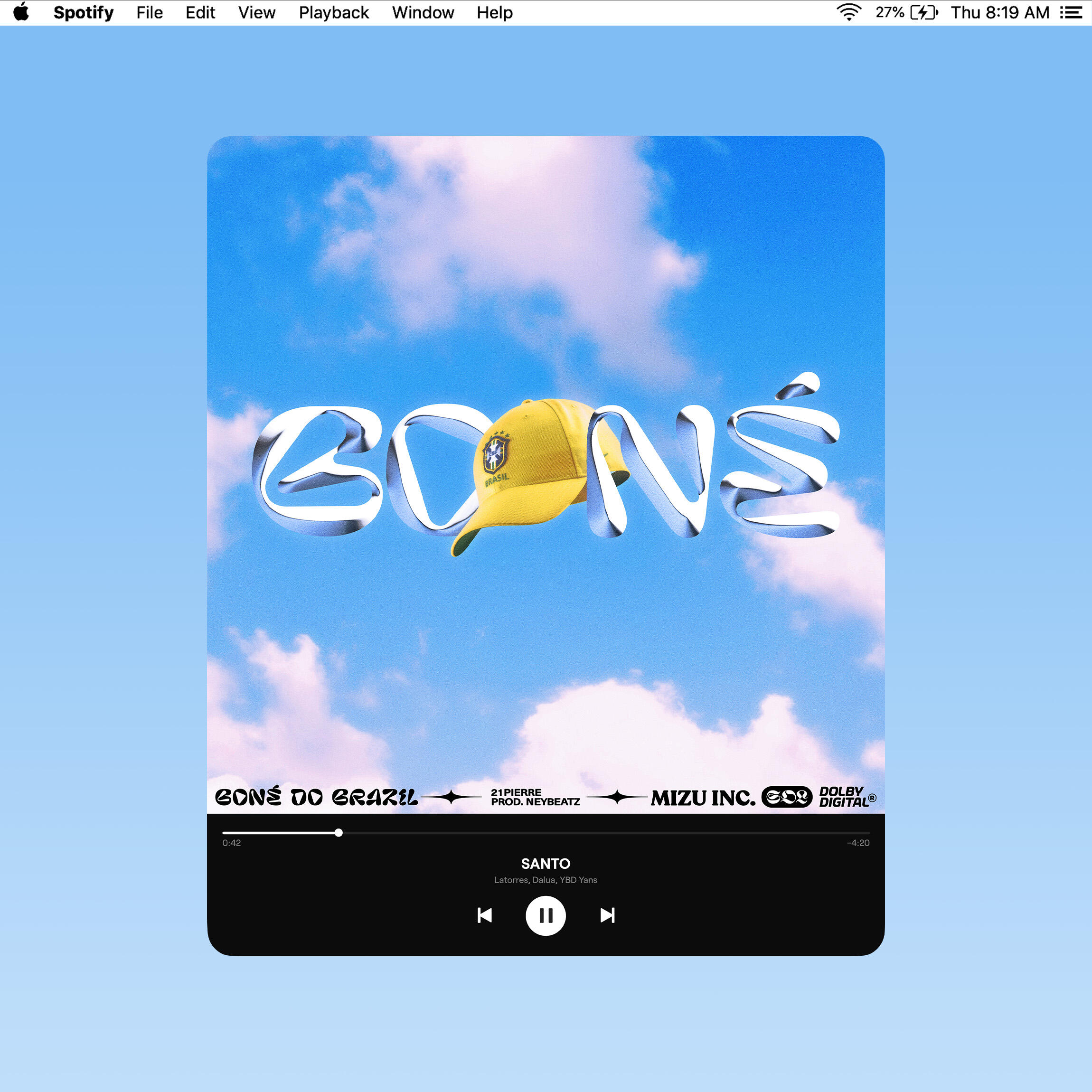
21Pierre - Boné do Brazil (Single), prod. Neybeatz
Work type
Commission
Single Artwork
10.2020
Description
██"Boné do Brazil" is the first single of an upcoming project from 21Pierre, an independent brazilian artist from the Mizu Label. The theme revolves around the lack of "movement" and overall numbness of these times.
Track name
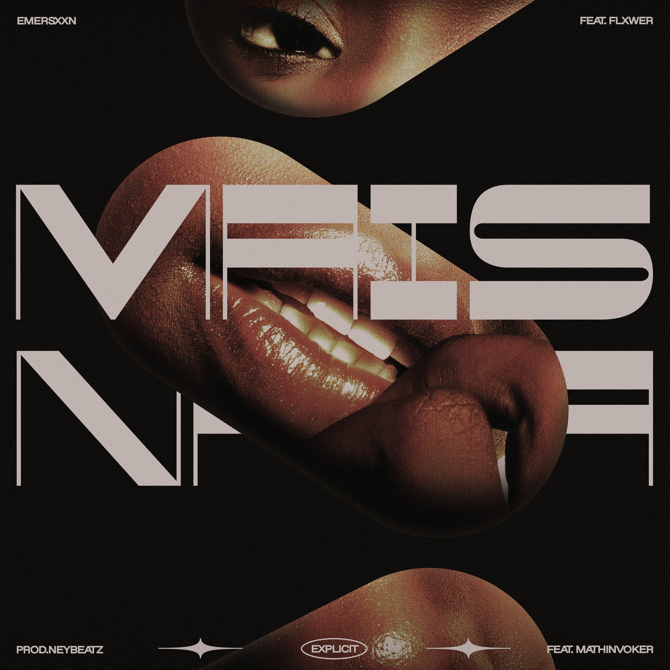
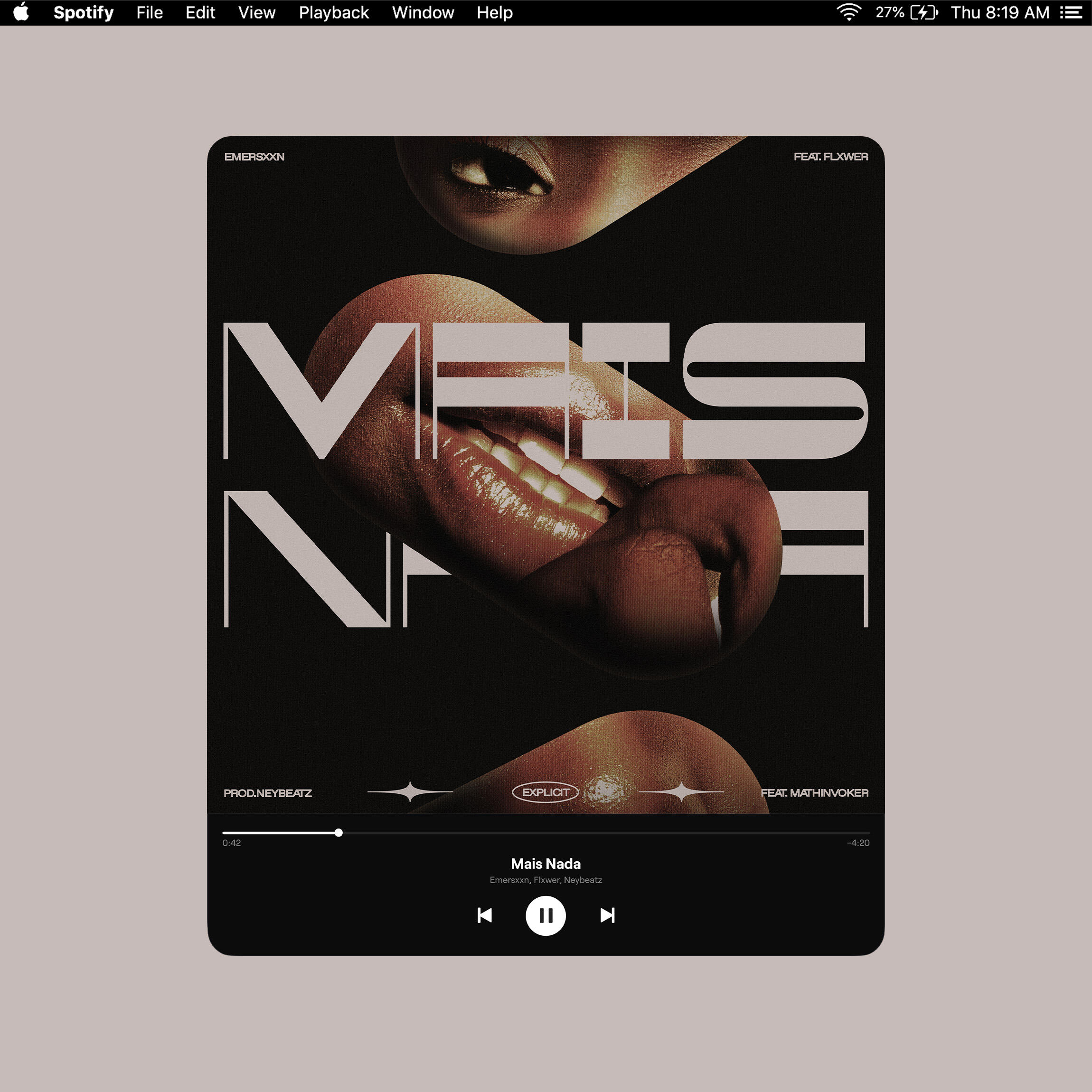
Emersxxn - Mais nada (Single), prod. neybeatz
Work type
Commission
Single Artwork
10.2020
Description
██Mais Nada is a single from the RS based artist, Emersxxn. The theme revolves around the recurring desire to escape reality through love and sex.
Cover Art Commissions 2021
EP
Hoje cedo eu te deixei morrer
Work type
Commission
EP Artwork
06.2021
Description
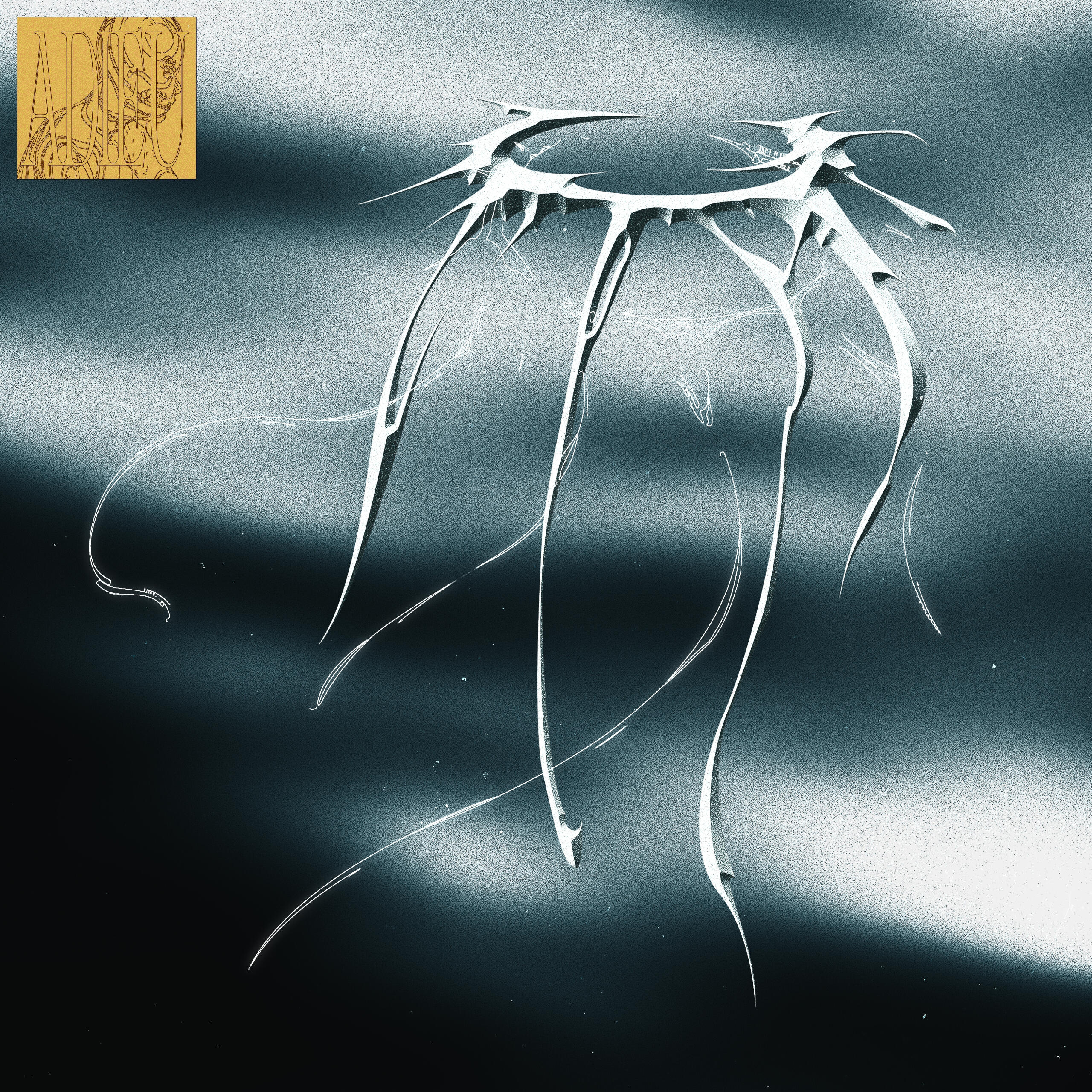
██"hoje cedo eu te deixei morrer" is the second EP self released by brazilian producer / singer / songwriter adieu.
██After his first concept project "Distrações (Mixtape)", the new collection of songs revolves both lyrically and aesthetically around diving deep in a ocean of melancholy and self-reflection.
Link
Track name
Enzo Dicarlo Feat. Robrxk, Oliver Trash - Sozinho
Work type
Commission
Single Artwork
03.2021
Description
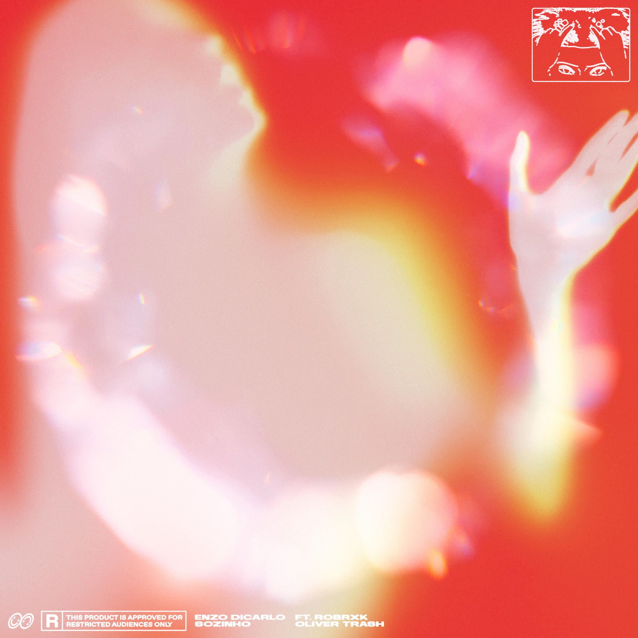
██"Sozinho" is the new single from the multidisciplinary music artist, Enzo Dicarlo.
██The song is a colorful and progressive outburst of feelings after the break up. A failed, yet beutiful, tentative of finding solace and confort by confronting conflictuos feelings.
Link
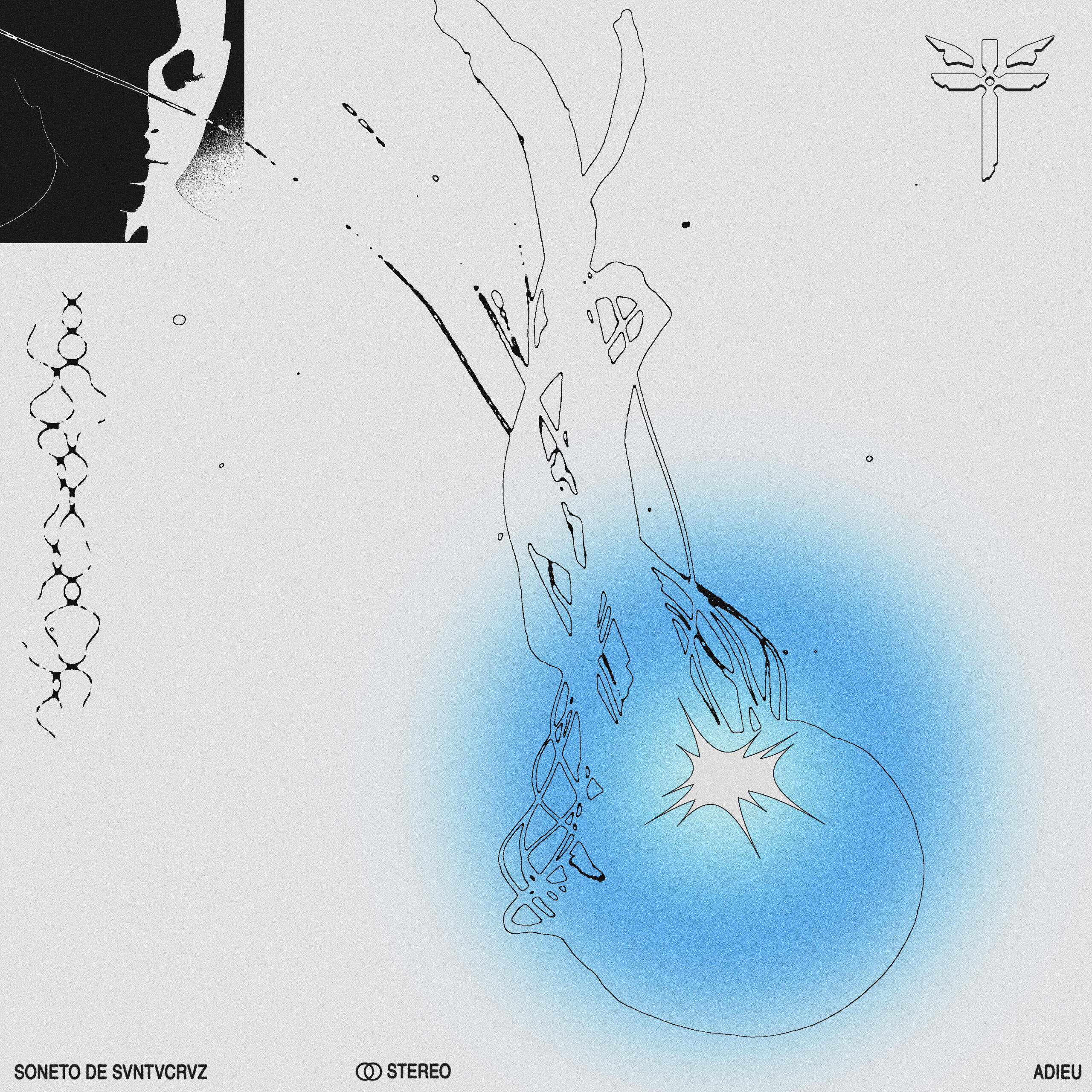
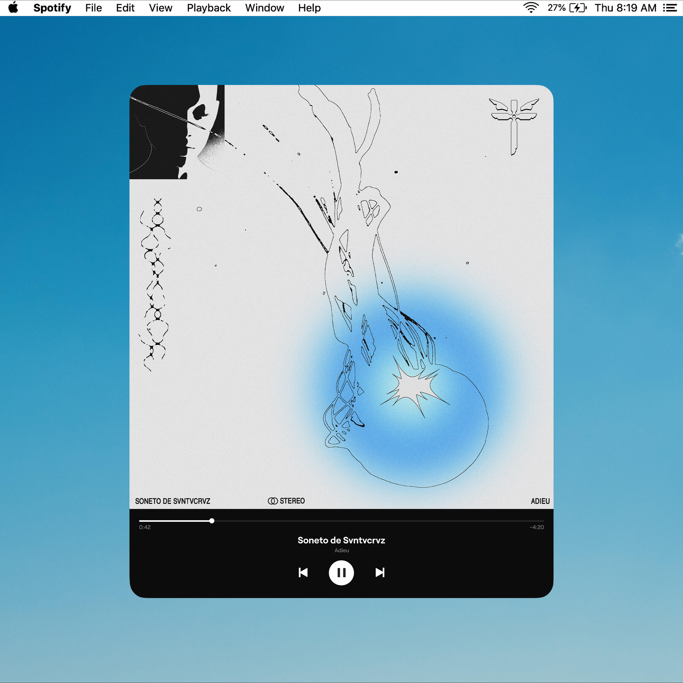
Track name
Adieu - soneto de svntvcrvz
Work type
Commission
Single Artwork
01.2021
Description
██"Soneto de Svntvcrvz" is the first single by producer and composer Pedro Lucas Ferraz under his solo project "Adieu", being a reinterpretation of track 6 "Soneto de Santa Cruz" from the album "A Praia" by Cícero Rosa Lins.
██In his version, Adieu brings a new aesthetic to Cícero's composition, working multiple layers of voices with distorted timbres and textures over the song's arrangements.
Link
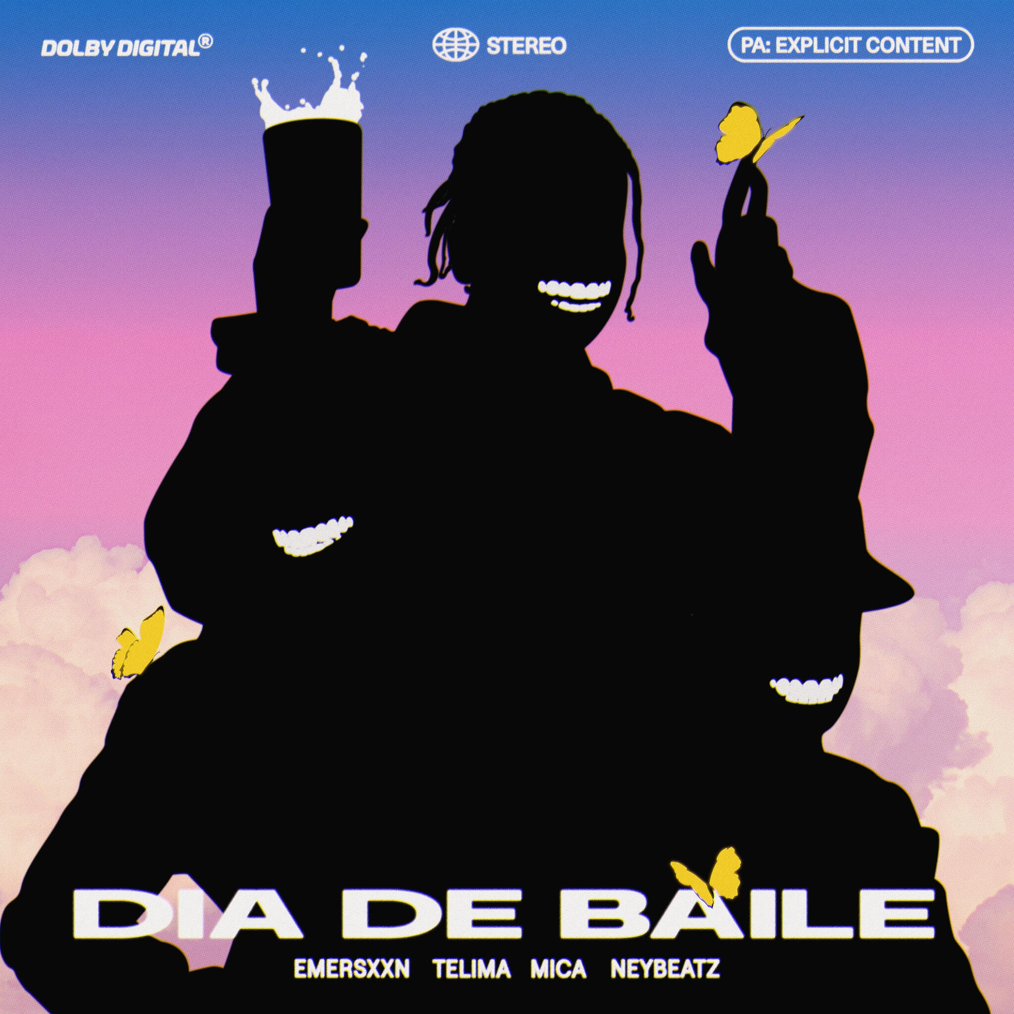
Track name
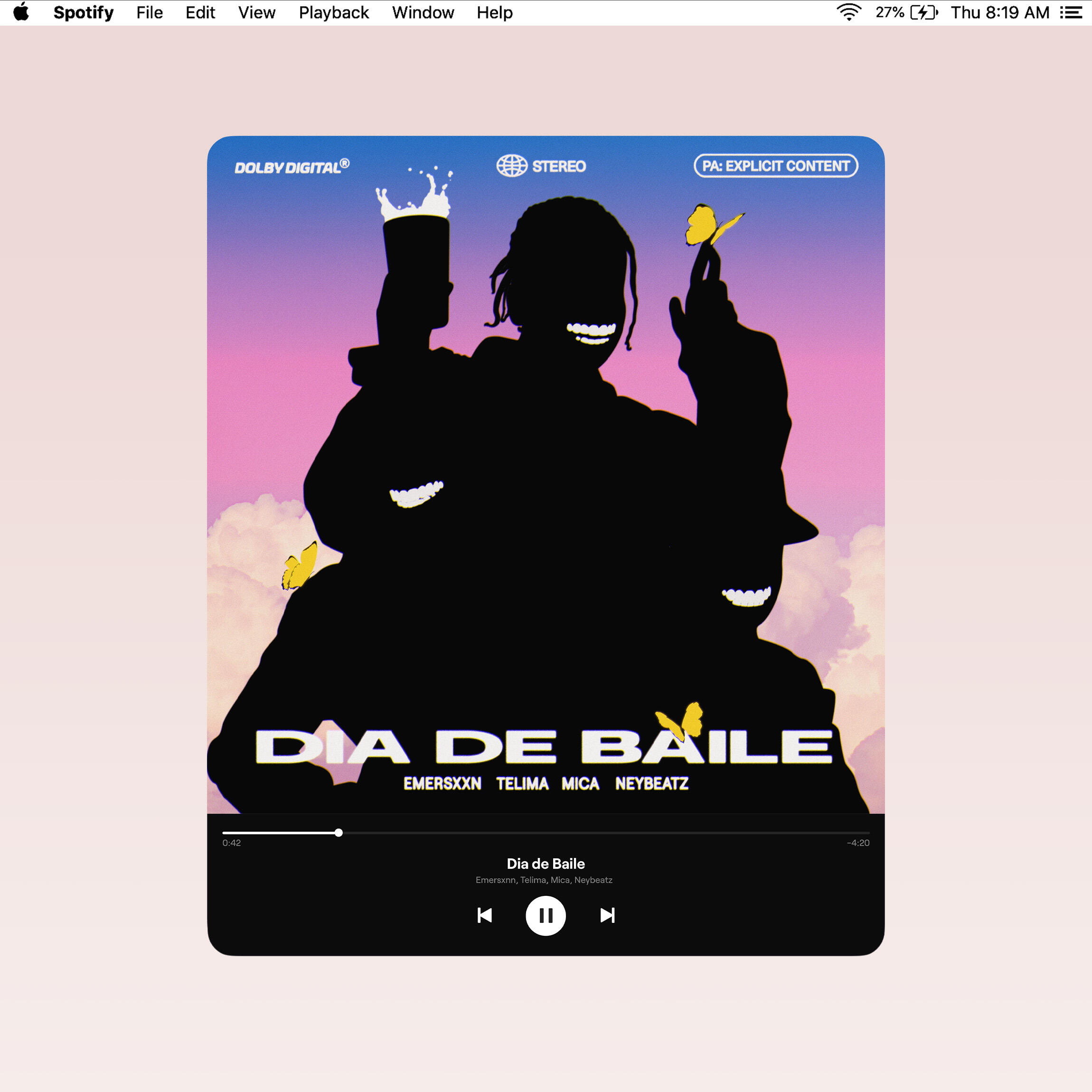
Mizu x Blvckmob - Dia de baile (Single)
Work type
Commission
Single Artwork
01.2021
Description
██"Dia de Baile" is a collaborative single between members from Blvckmob and Mizu Collectives.
██Mica, Telima and Emersxxn delivers infectious flows, expressing the feeling of anticipation for going outside on friday nights, all under Neybeatz colorful production.
Link
Next: Dark Futur →
Mizu Inc. ID
Concept, Design
& Art direction
██
©SOL & Neybeatz
██MIZU Inc. is an independent music collective from Porto Alegre, Brazil. They make very refined atmospheric trap music in the same lane of SAFE, NO1-NOAH, Travis Scott among others.
██
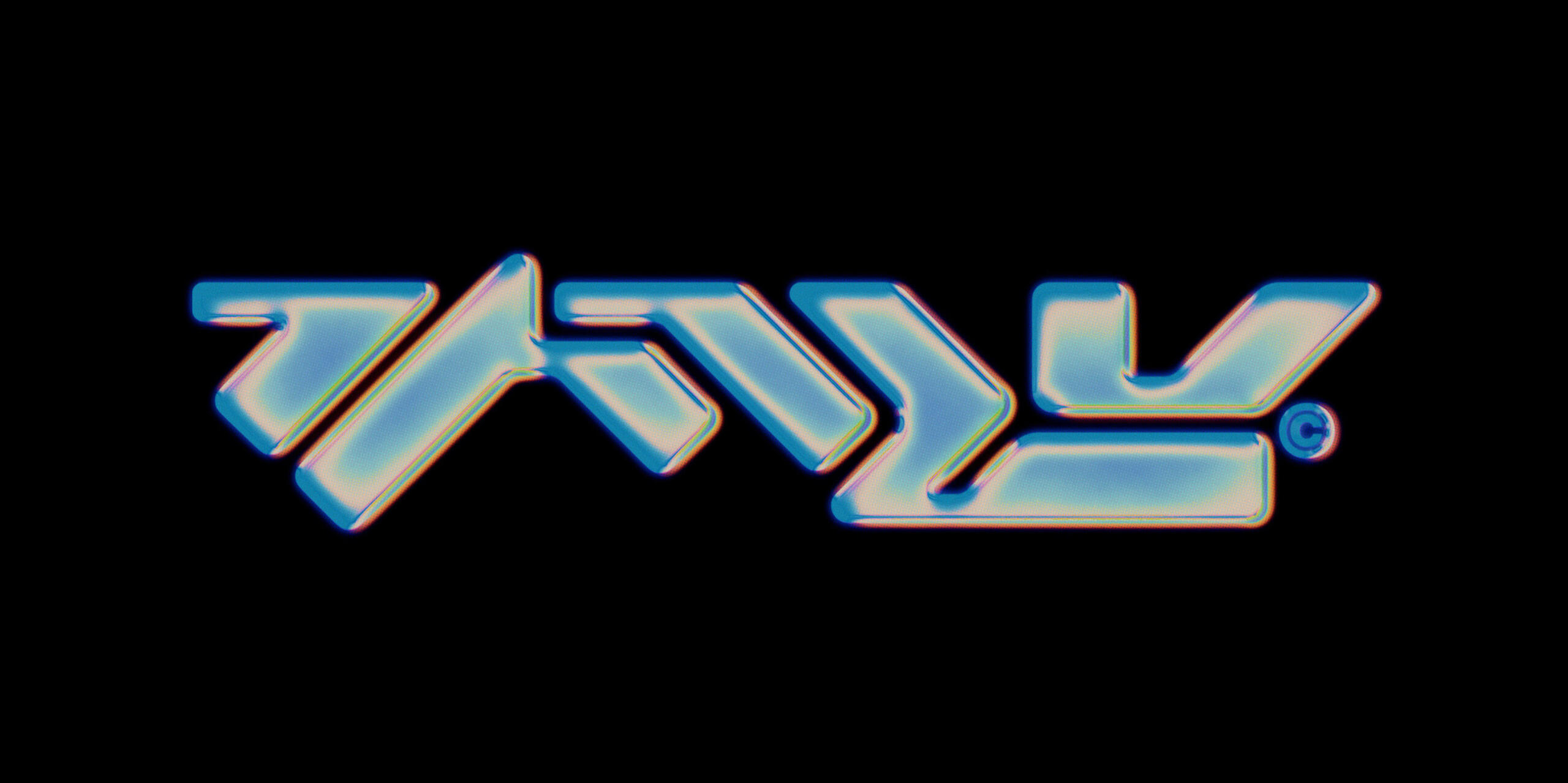
██Romano & Ney started the collective around 2018 with a simple element as a central concept: water. From there they pulled inspiration for their production, themes and overall aesthetics. Since that period, MIZU kept the same symbol of a bottle of water with the water kanji "水" as the trademark for the movement.
██
██This case will show all the experiments, made between late 2020 and early 2021, that led to the final redesign of the symbol.
01. Água Vol. 1 — Dec 2020
02. "水" Type study — Jan 2021
03. New Identity — Jan 2021
01. Água Vol. 1
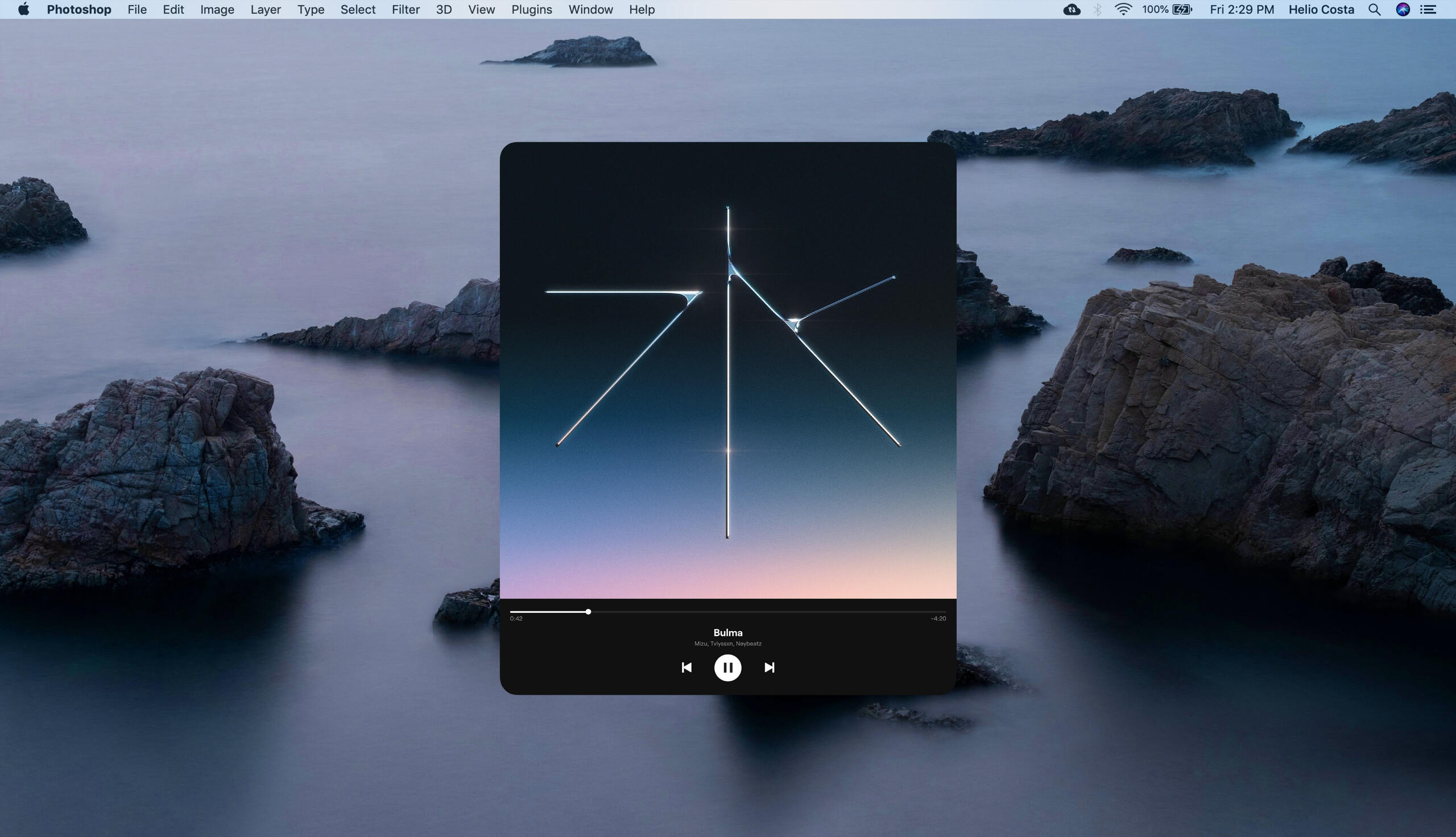
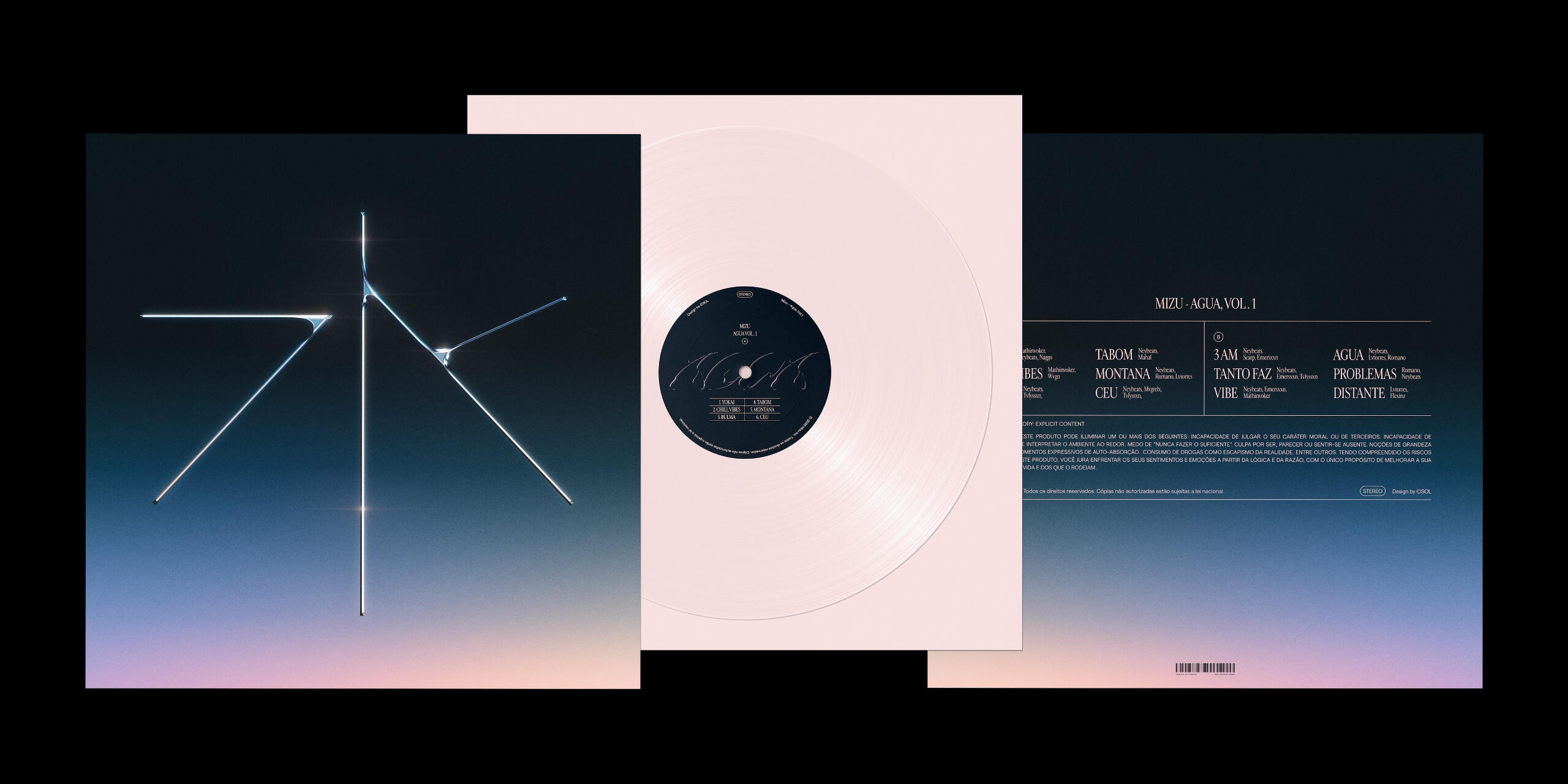
██A concept compilation album for the singles released between 2019 and 2020. The direction here was to use a crystallized water kanji as the main piece and simple colors to support the composition, matching the minimalist production of the tracks.
██
██The object can also be perceived as a fine jewelry, an element very prominent in the modern trap culture.
Concept
Album Cover Art
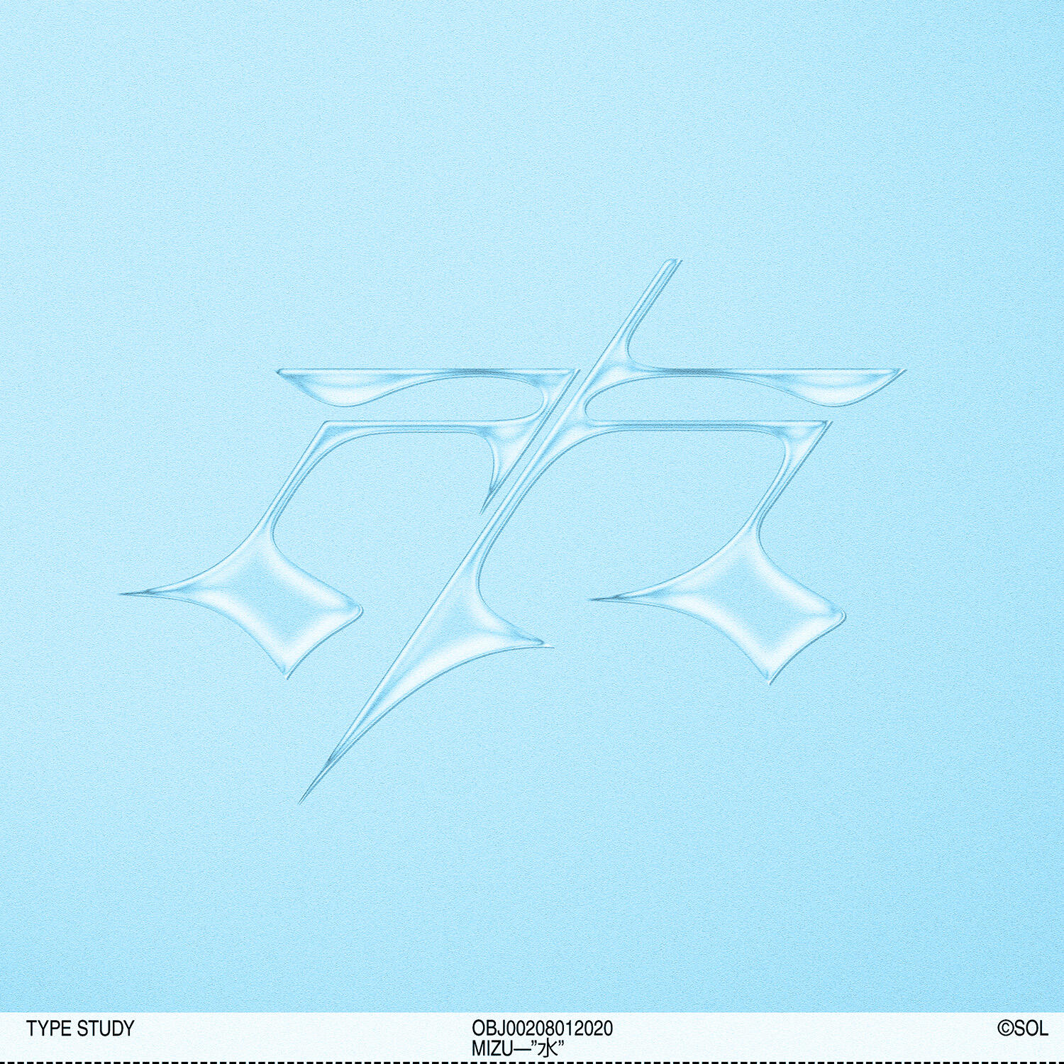
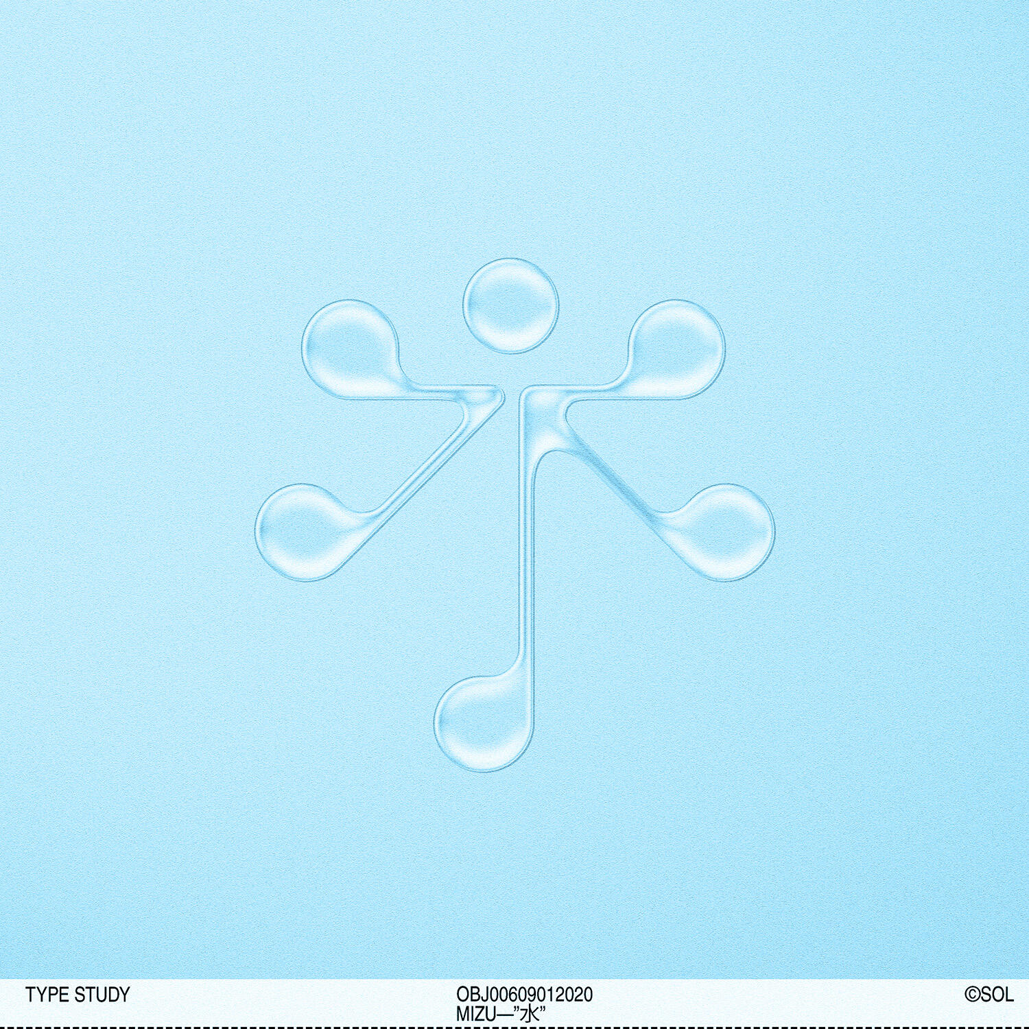
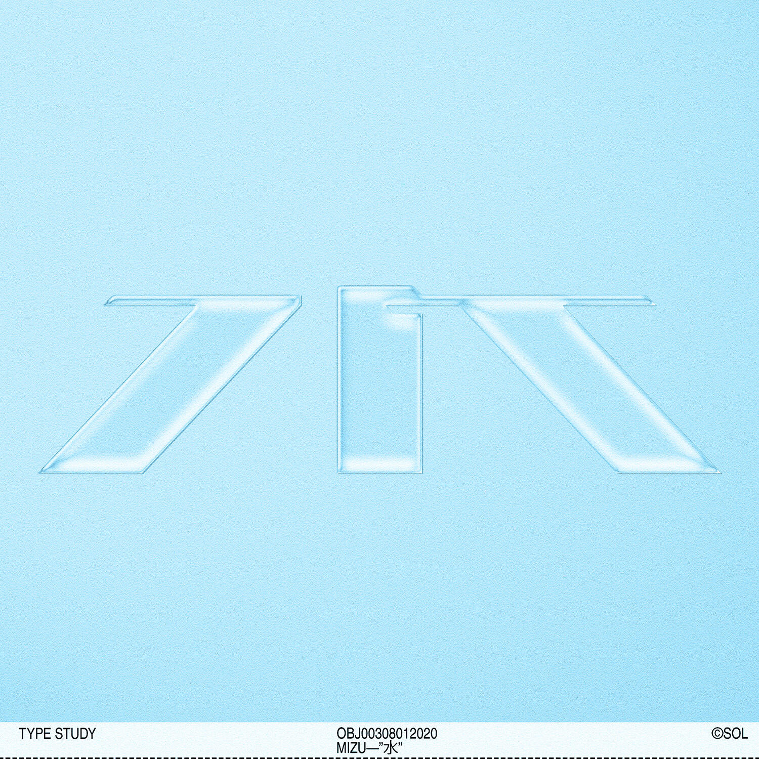
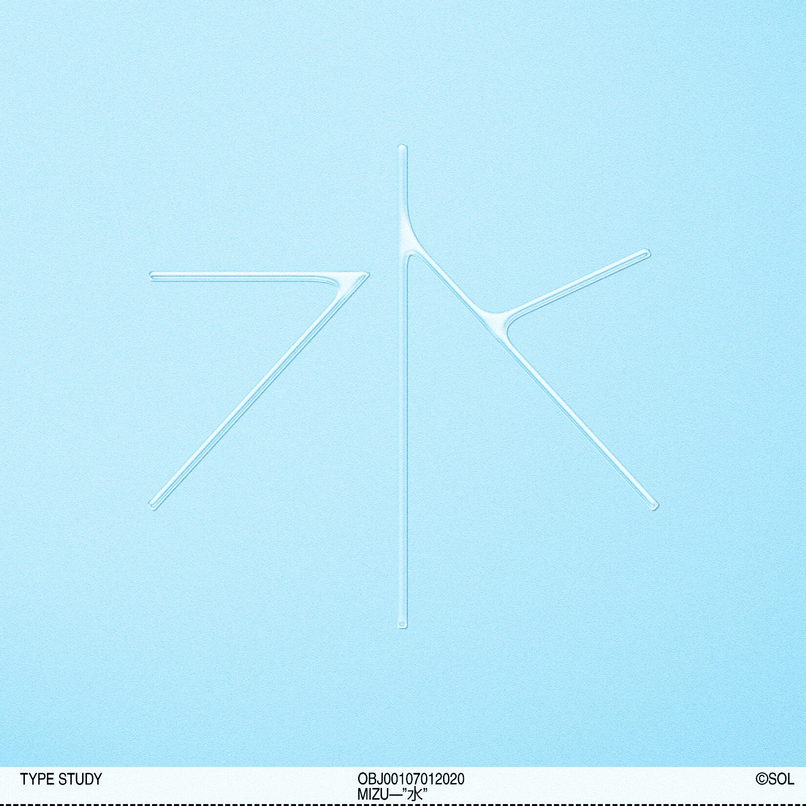
02. "水" Type study
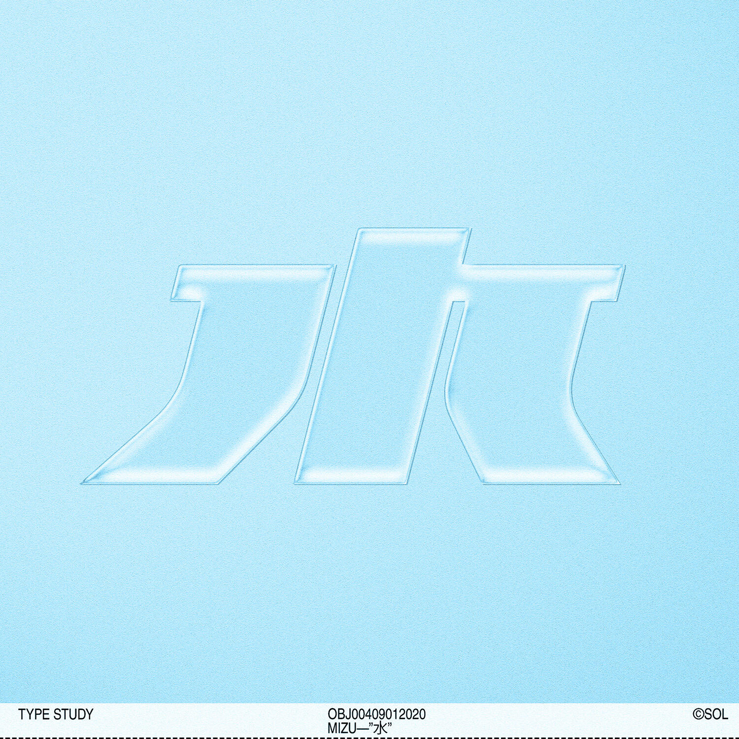
██This study explores different expressions of the kanji "水" (water) in a more experimental, contemporary style. It also introduces a more "watery" treatment for the type, deepen the initial concept that sparked the collective back in 2018.
Typography & Iconography
Experiment

03. New identity
██After a couple of weeks, we were able to pin down the identity, bringing everything that was good from the experimentation phase.
Identity
Showcase
Trademark Design - Reduced


Trademark Design - Full


Plain Colors


FULL TREATMENT
